Hoit
An integrated service that centralizes scattered campus information
at Korea University for efficient, consistent, and accessible use.
Play Store
Korea University
UI / UX Design
Figma, Adobe Illustrator
2023-2024
Fragmented systems waste time
Essential services were split across multiple sites with inconsistent UIs and separate logins, creating inefficiency and confusion.
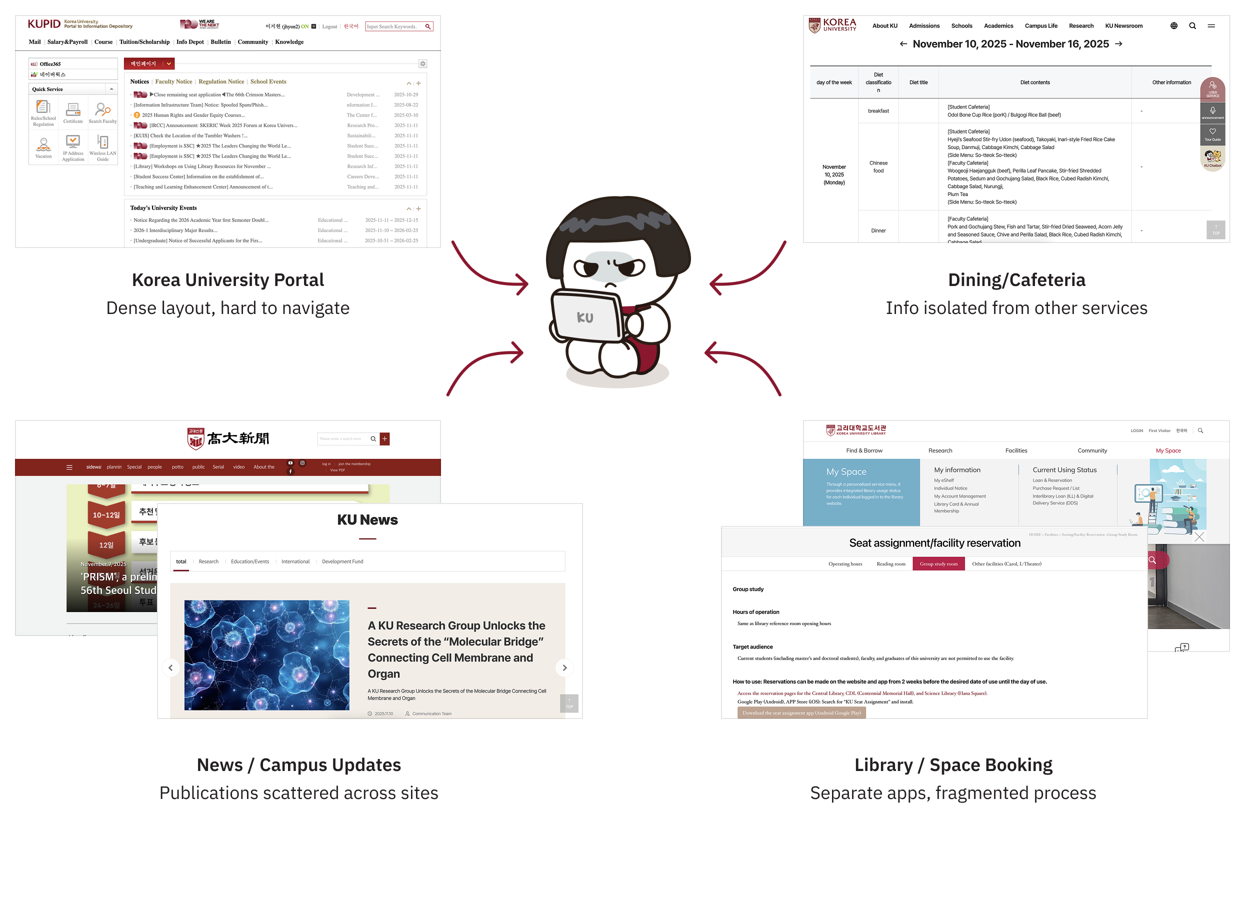
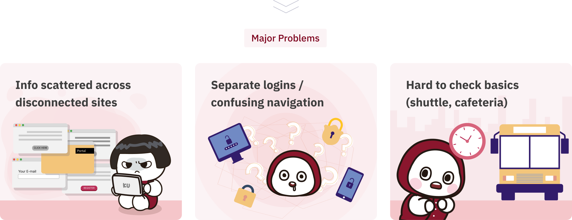
University members must visit various unrelated sites to access basic services.
This fragmentation creates a disjointed and inefficient user experience.
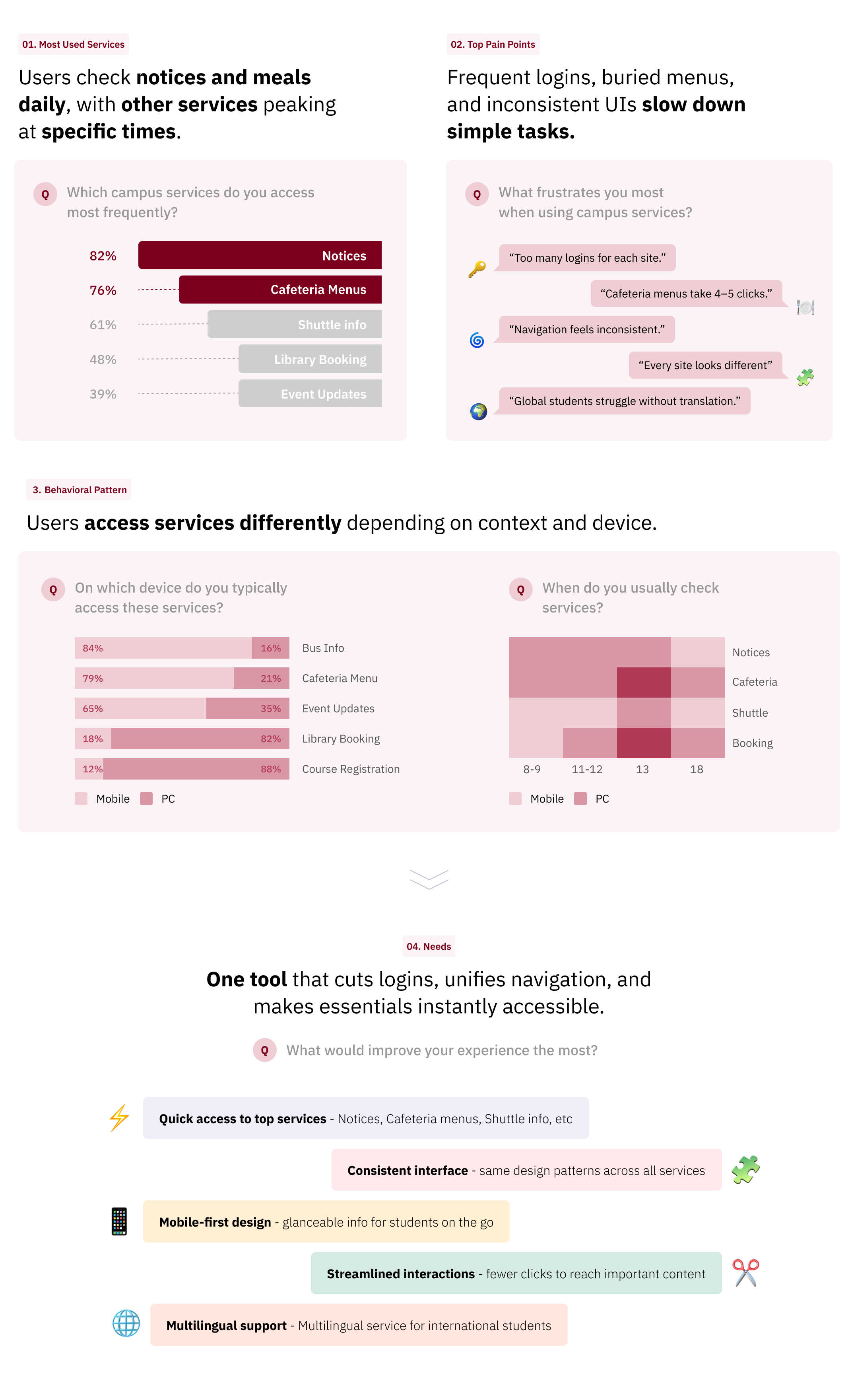
To understand actual needs, I analyzed usage patterns and gathered feedback from students and staff
Research revealed that students frequently encountered difficulties navigating multiple services, struggled with inconsistent interfaces, and needed quick access to key campus information.
Based on insights, key principles were defined to guide Hoit’s UX and UI
These principles shaped Hoit’s interface and interactions:
frequently used services appear at the top in a scrollable menu, urgent announcements and events are immediately visible, and secondary content remains accessible without clutter.
How Hoit Guides Students Through Campus Services
Flowchart illustrating the user journey through Hoit, from opening the app to accessing top campus services efficiently.
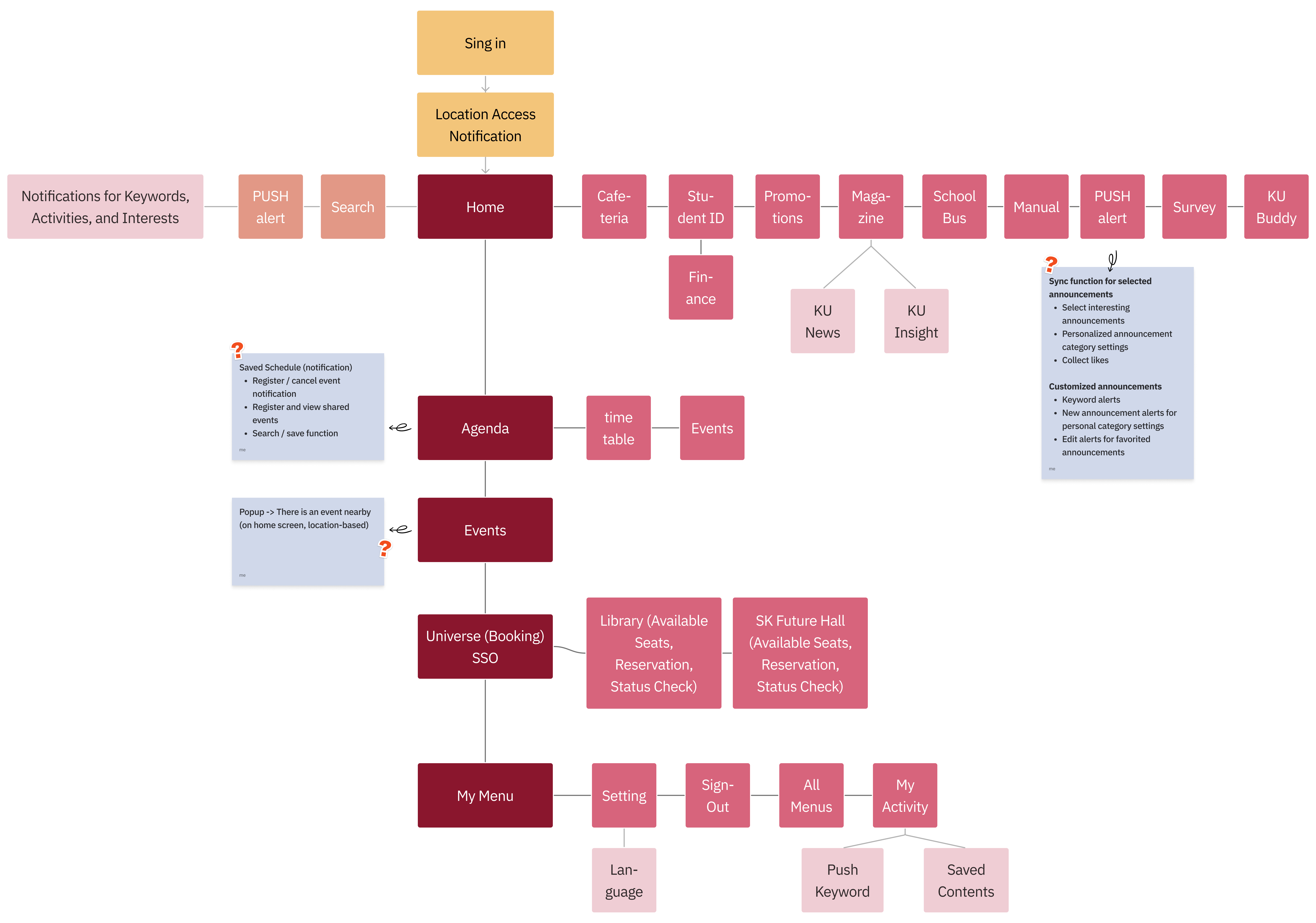
Students can access notices, cafeteria menus, shuttle info, and library bookings in 3–4 steps, reducing navigation friction.
From fragmented to unified
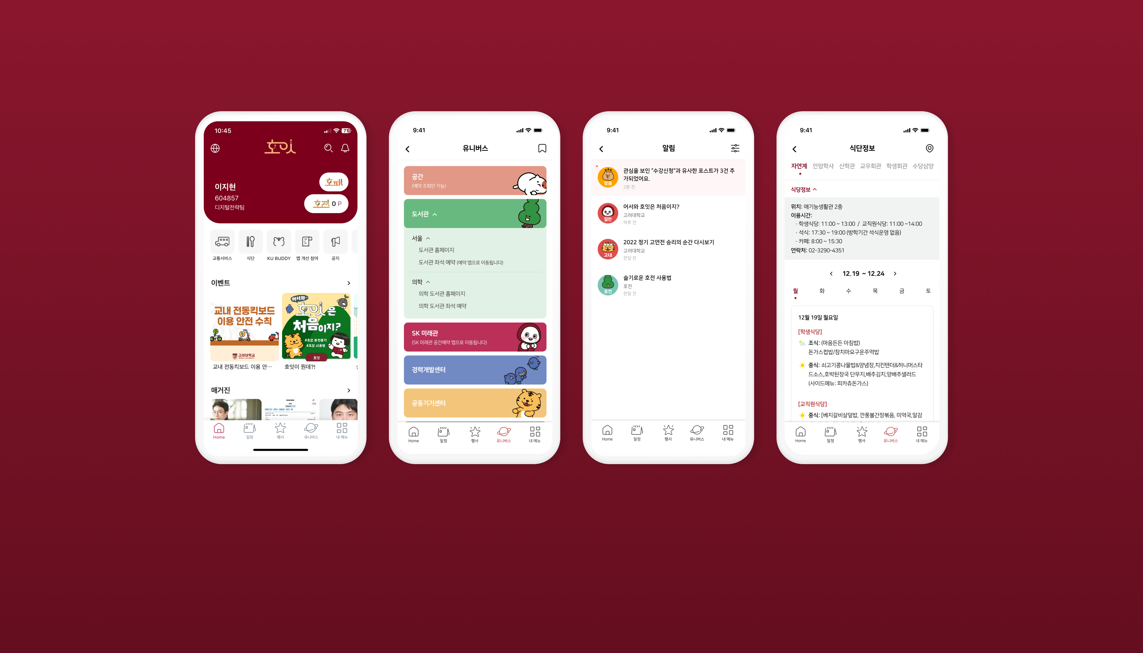
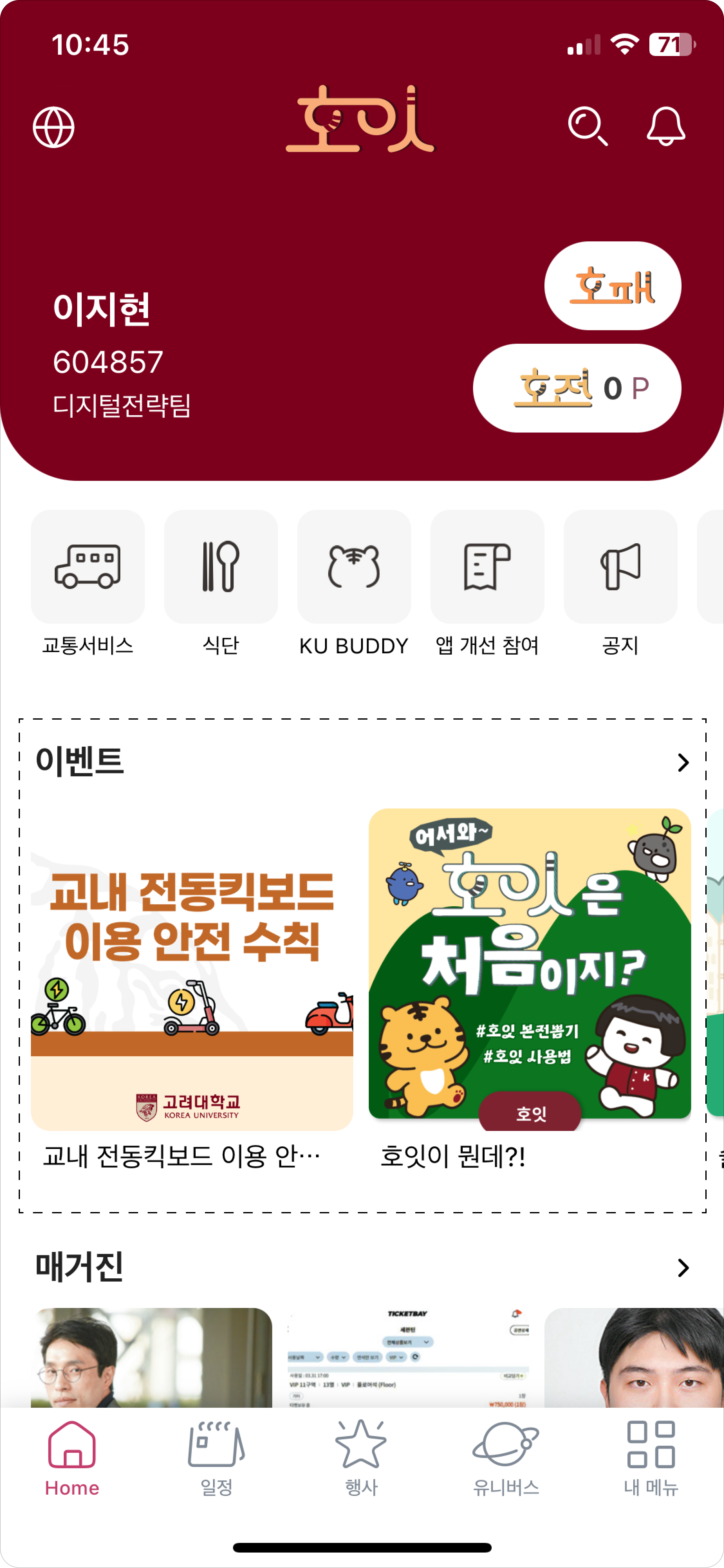
Designed to reduce cognitive load by prioritizing content. A digital student ID is placed at the top, followed by frequently used services and time-sensitive announcements, all structured for quick, intuitive access.
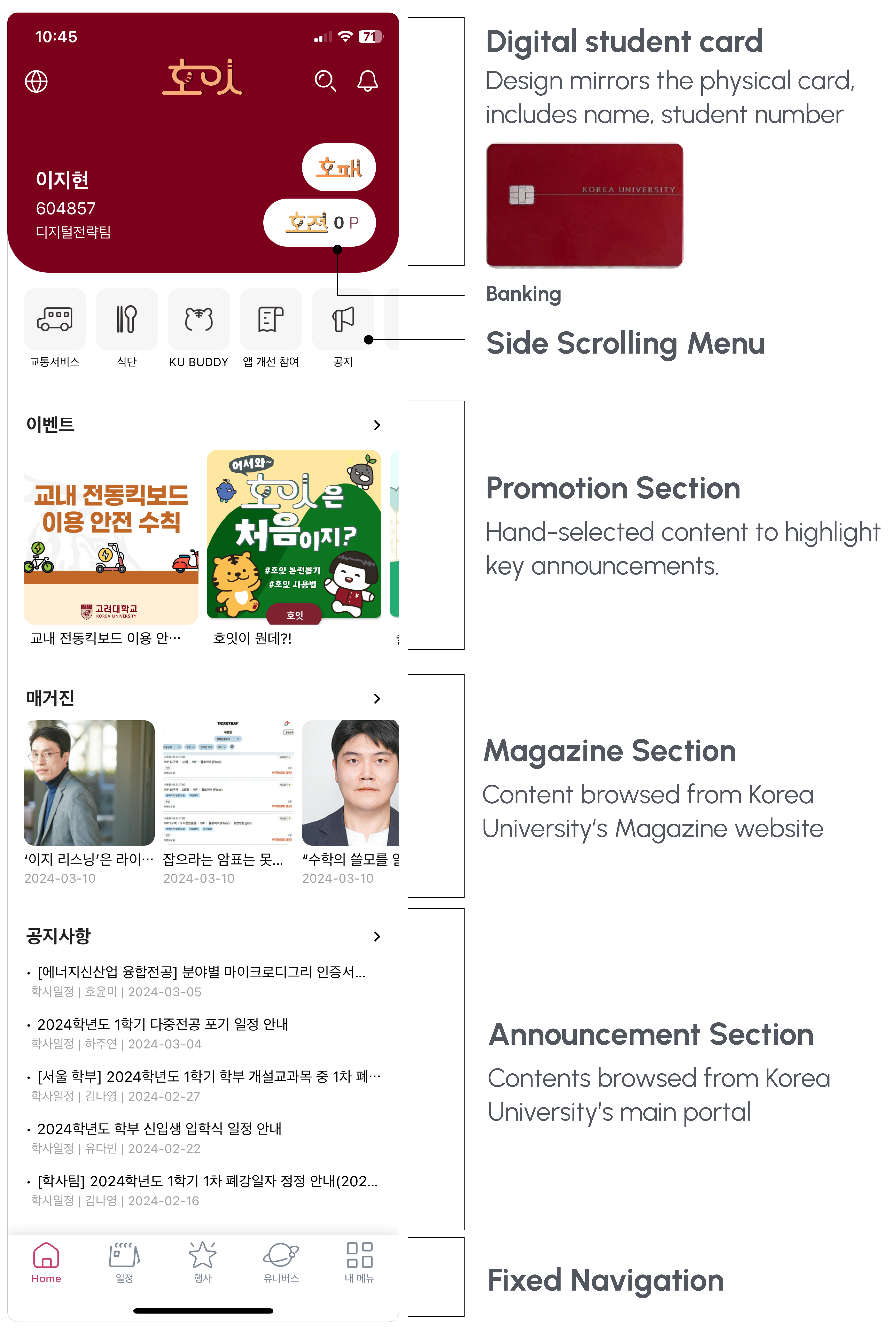
This section features key campus announcements and promotions at the top for maximum visibility, using a carousel to display multiple posts efficiently.
Events Section
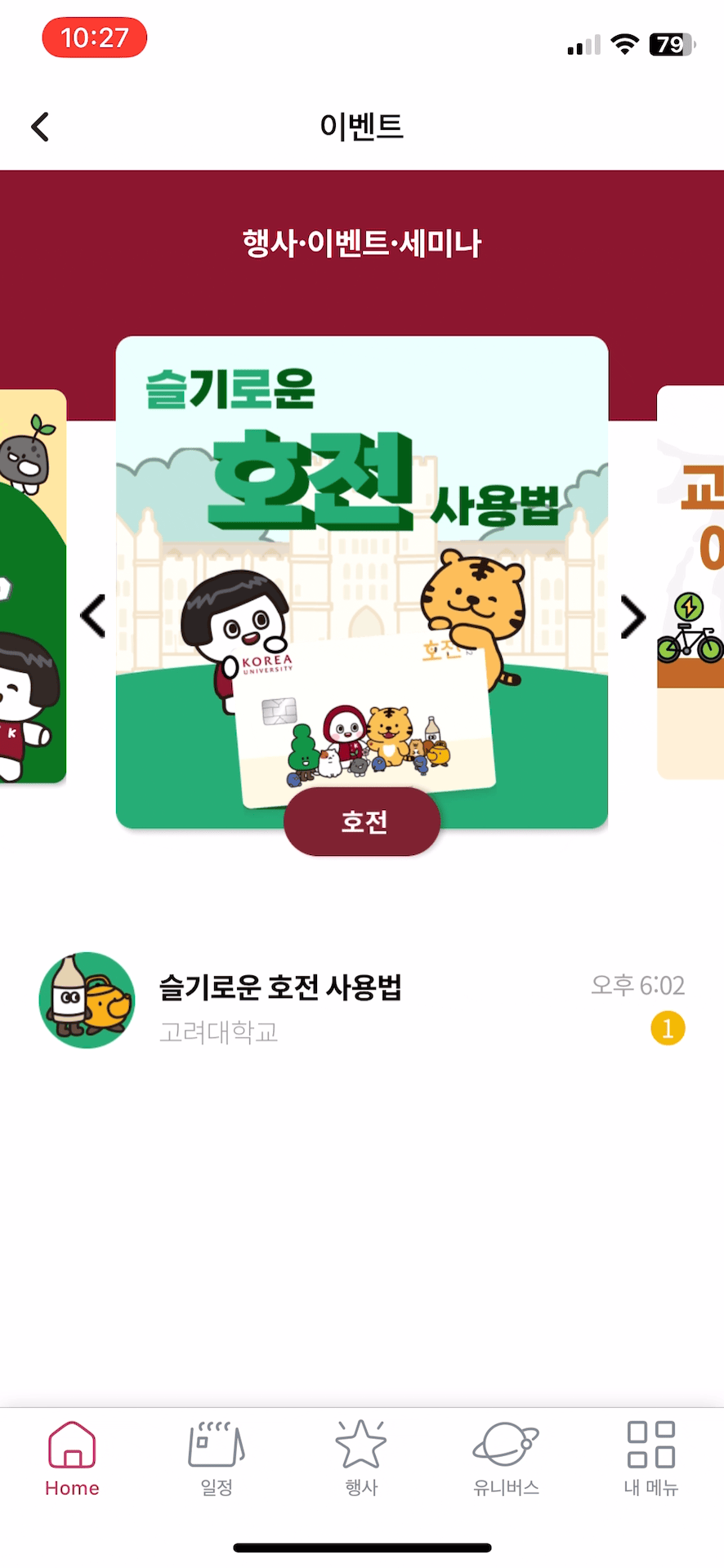
List of Events
Sliding carousel to accommodate limited visuals and multiple posts per event
Event Post
View post details
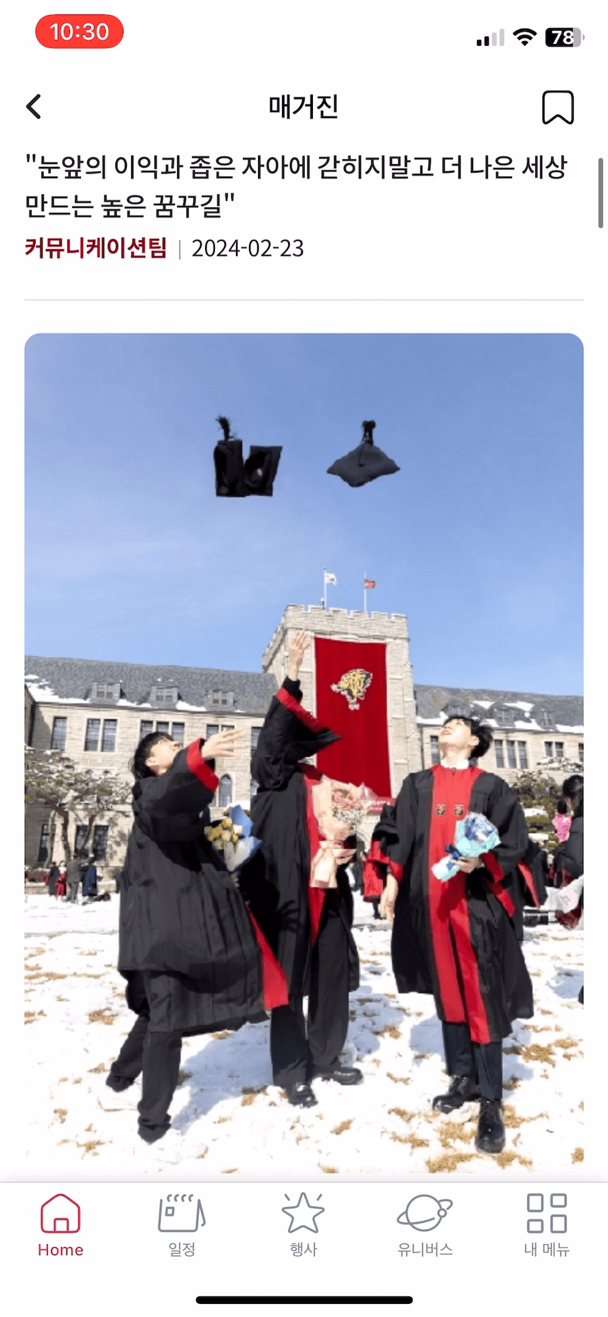
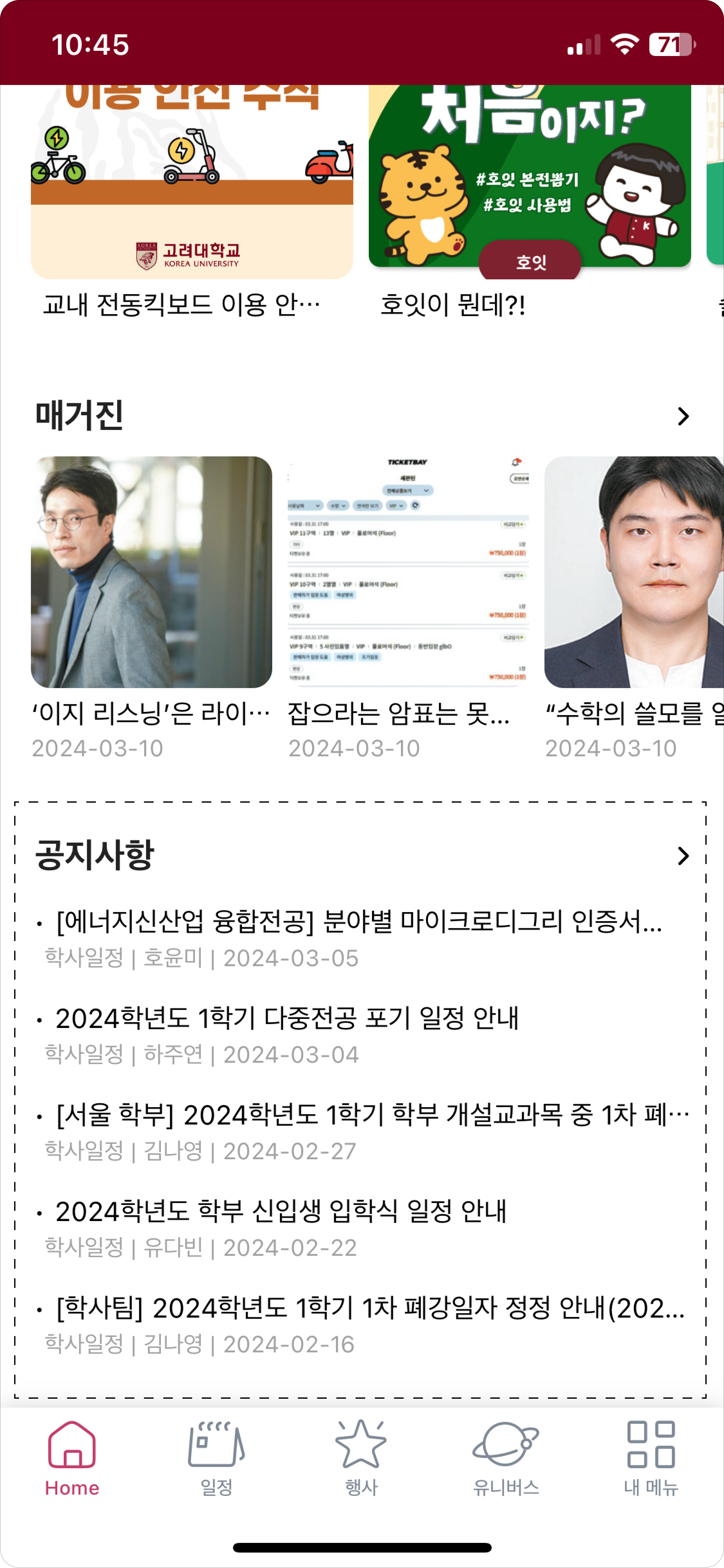
The Magazine page consolidates posts from three different campus news boards. To enhance accessibility,the area is divided into tabs, allowing users to view posts by category or bulletin board.
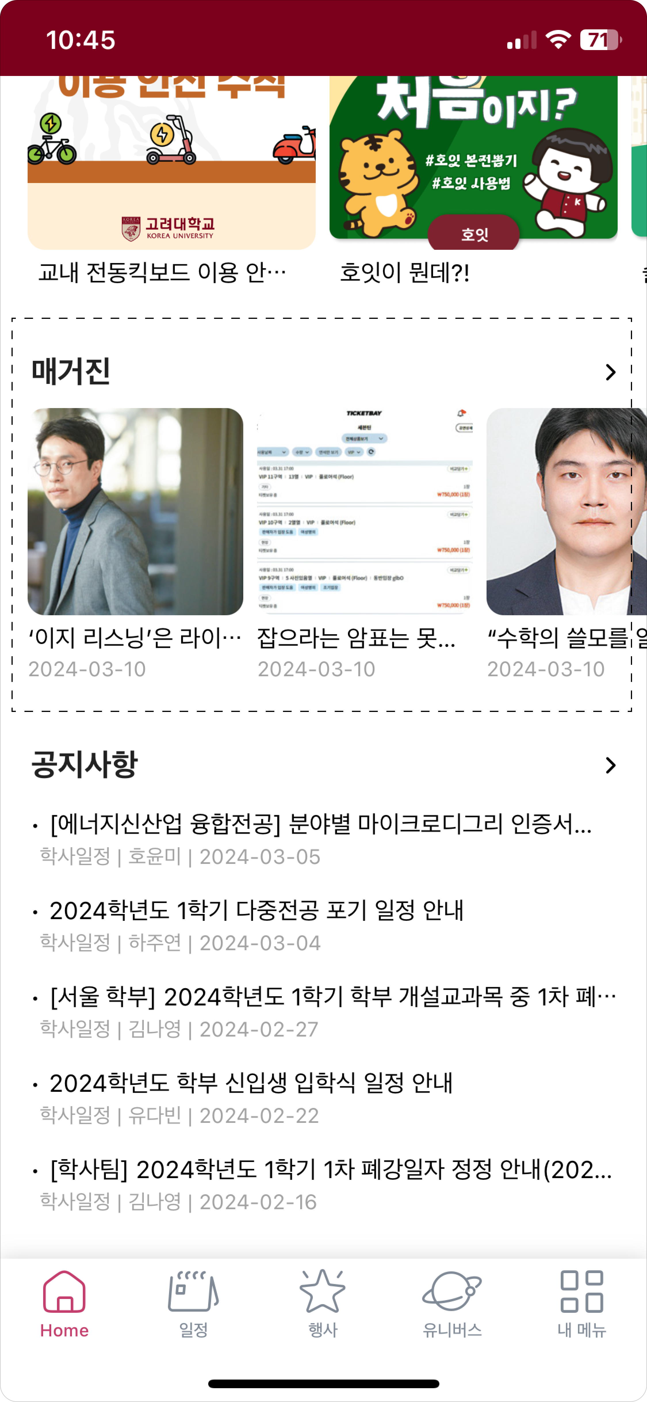
Magazine Section
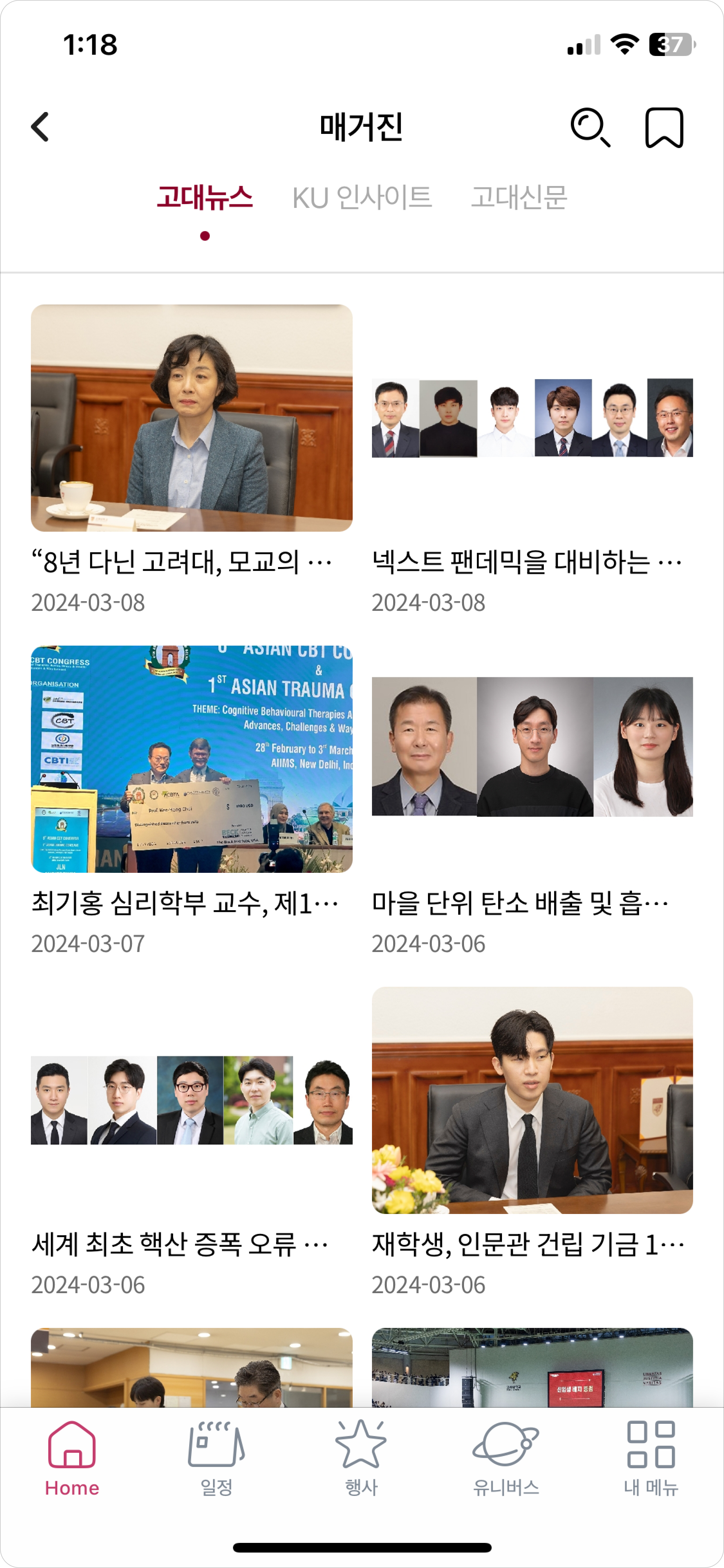
Magazine Posts and Boards
Curated posts from campus boards, organized for easy browsing
Bookmark
A pop-up interaction for saving posts
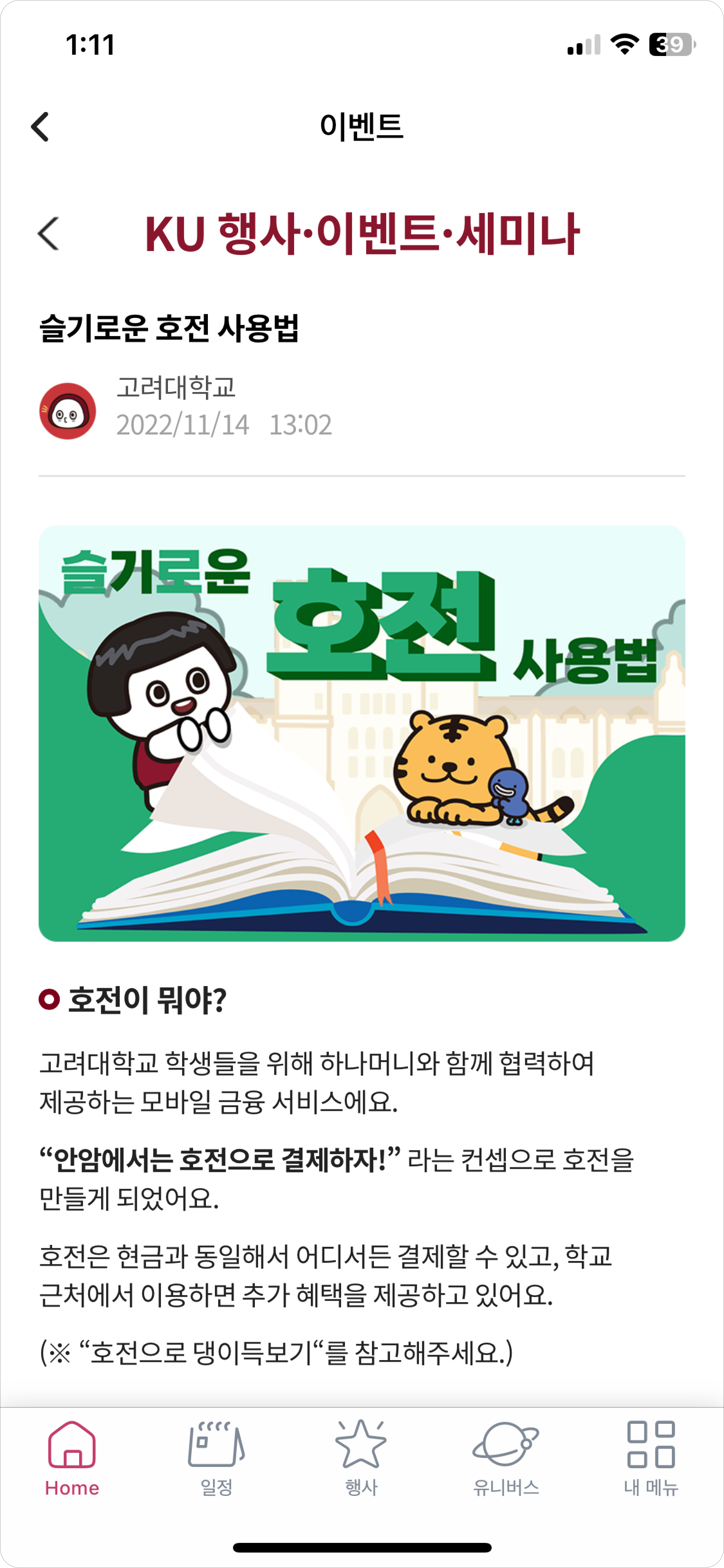
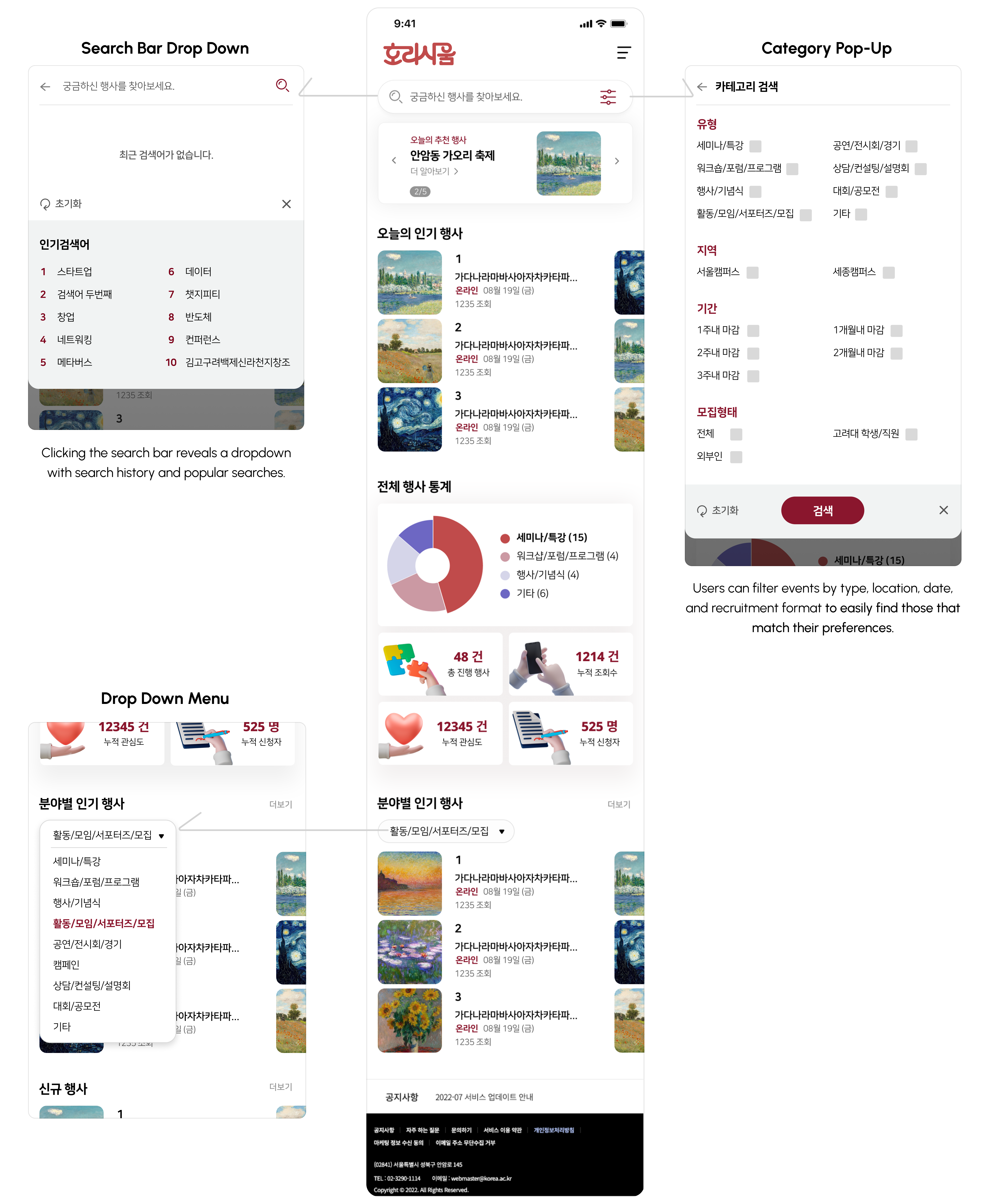
Official notices are sourced from the main portal, butHoit enhances usability with filters by board and topic, allowing users to quickly find relevant updates.
Notice Section
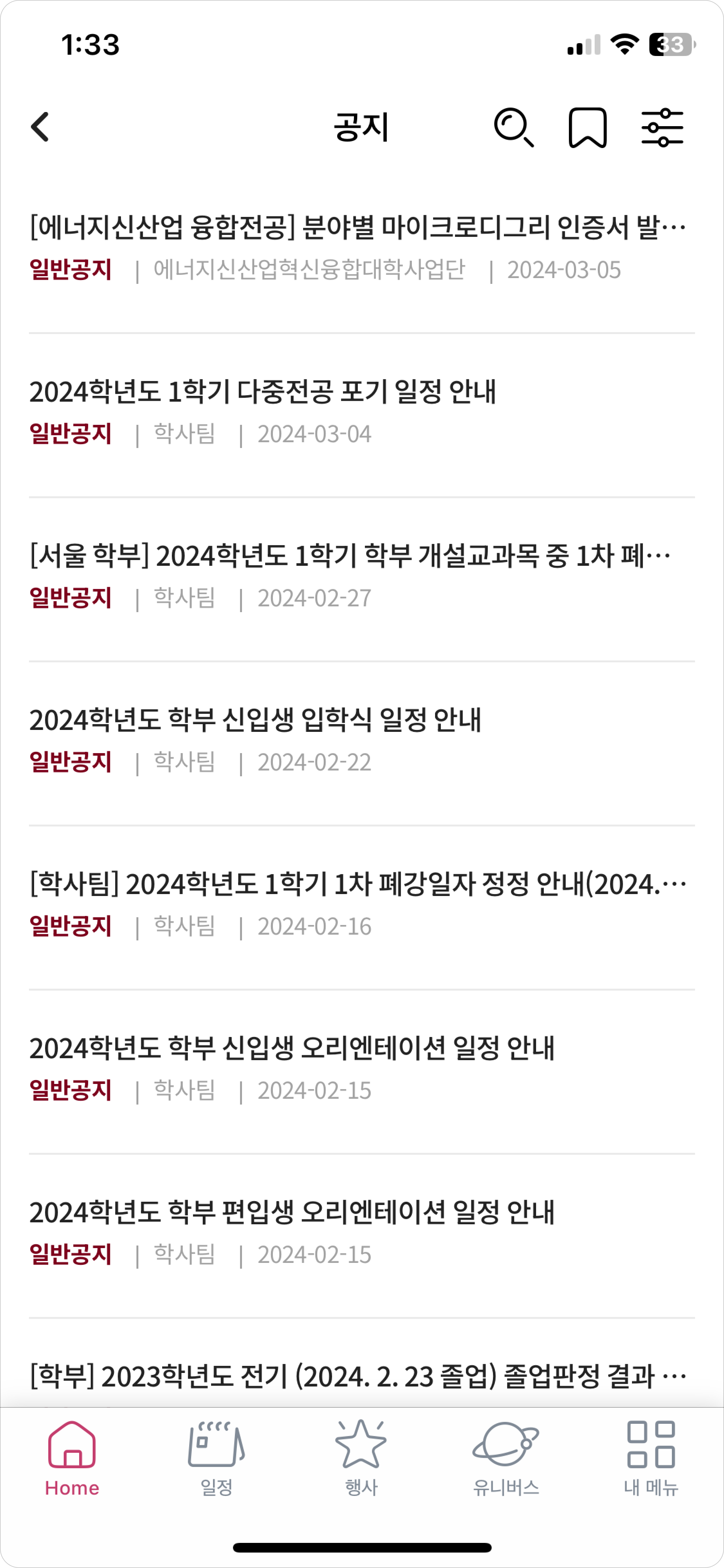
Notice Board
View the title, board type, author, and access saved notices

Filter
Use filters to view notices from the desired bulletin board
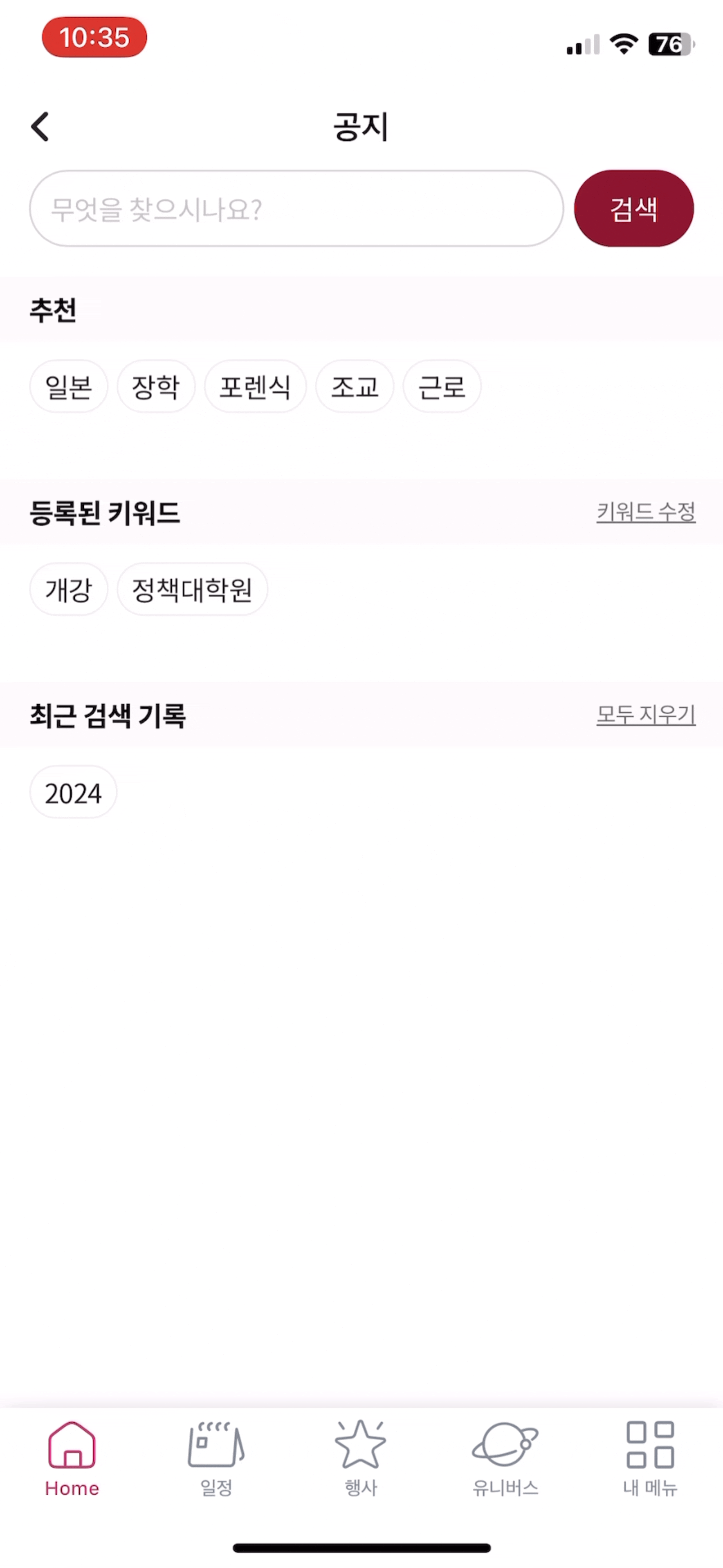
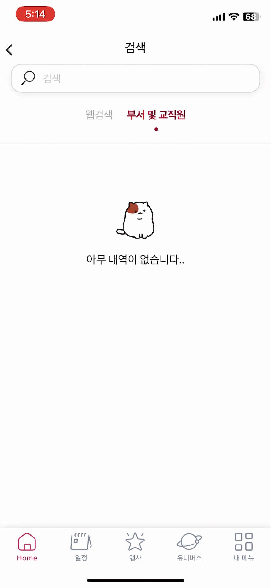
Search
Search for and find the desired posts
Horasium, a new event service launched with Ho-it, consolidates Korea University’s scattered event info from various faculty and department boards, improving accessibility and reducing fragmentation.
Push notifications alert users to important campus events and safety updates. Users can also set customizable keyword filters for personalized alerts.
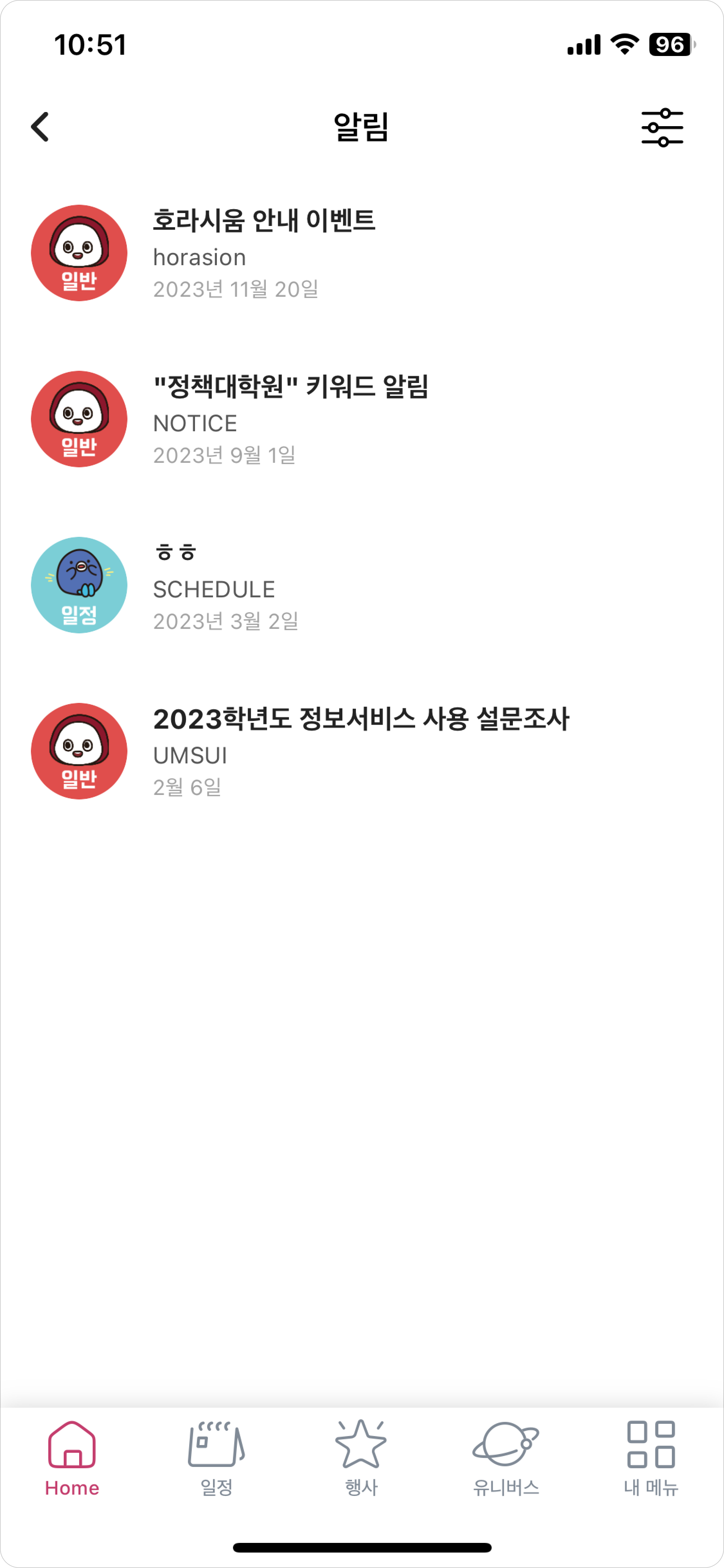
List of Notifications
Displays notifications from the calendar, keyword alarms, and general announcements
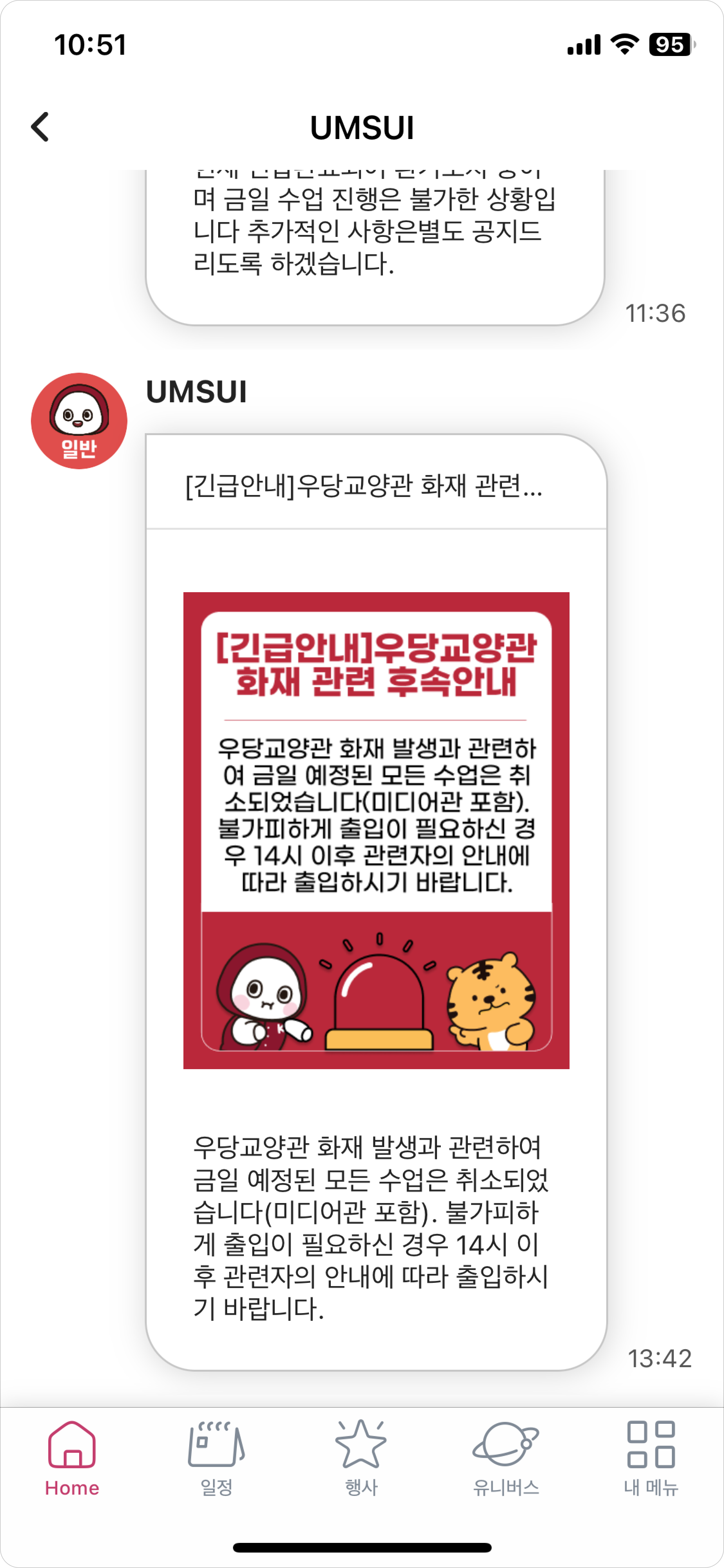
Notification Details
Each notification displays a headline, an image, and a message
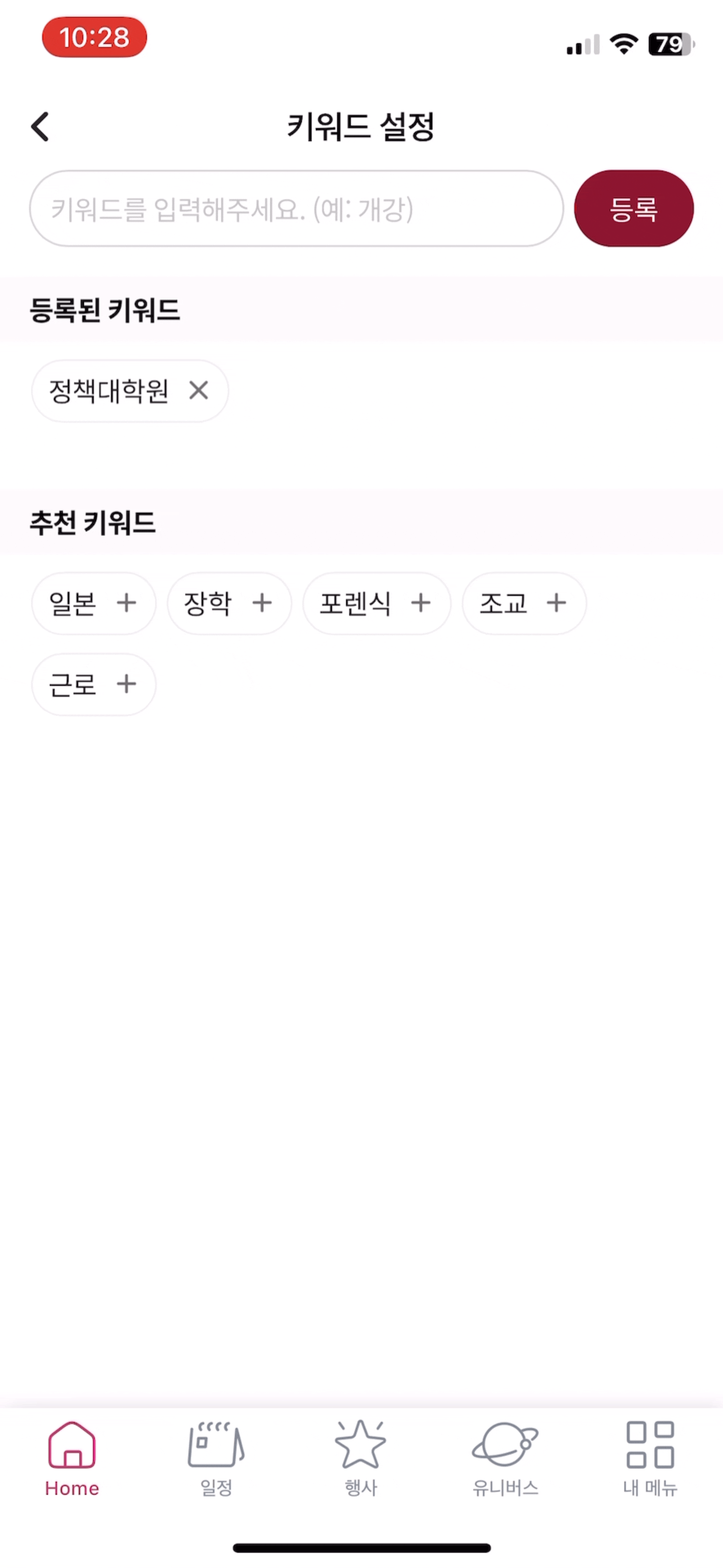
Setting Keywords
Set personalized keywords and explore suggestions
The calendar has three tabs: Personal Schedule, Campus Events, and Class Timetable. This setup makes iteasy for users to navigate between their own plans, academic schedules, and campus activities.
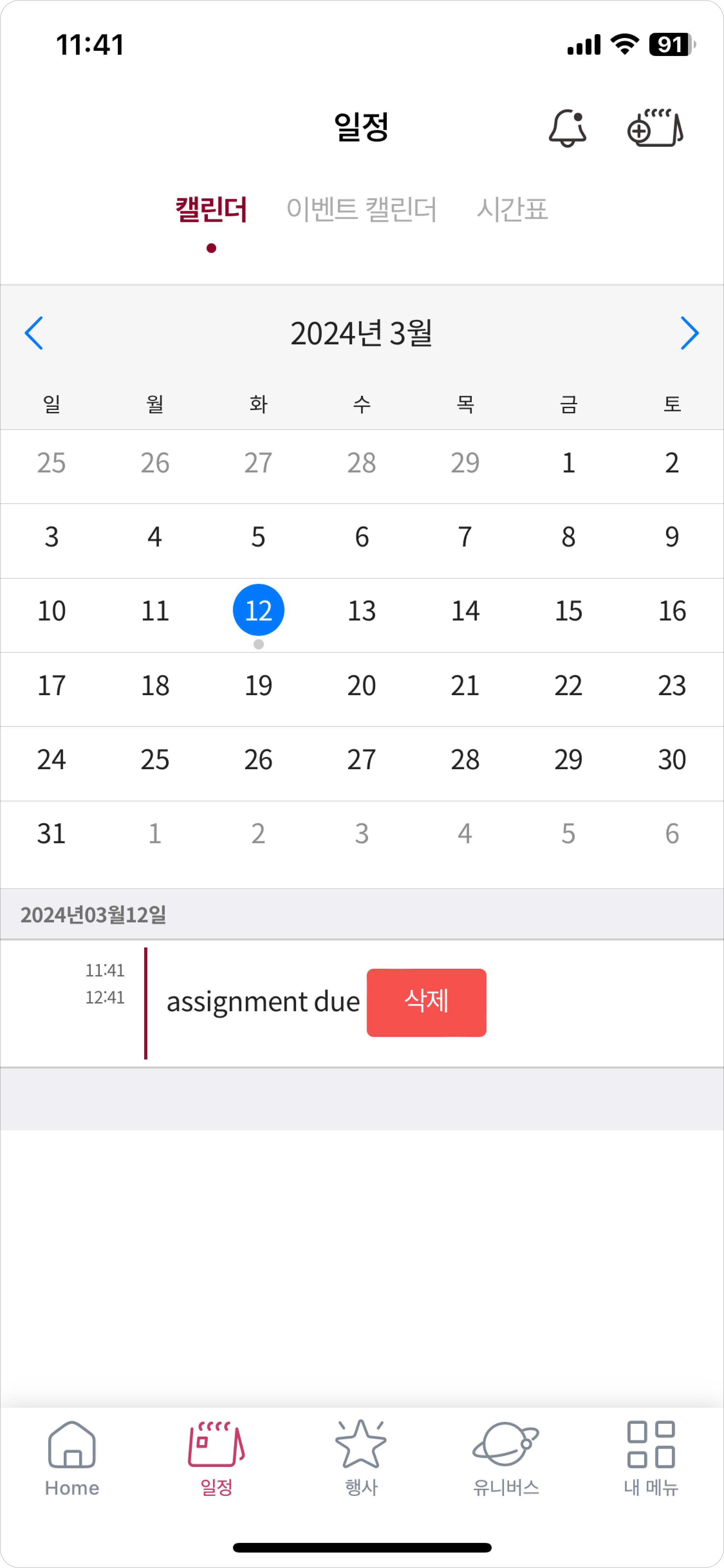
Personal Calendar
Can add events to the schedule
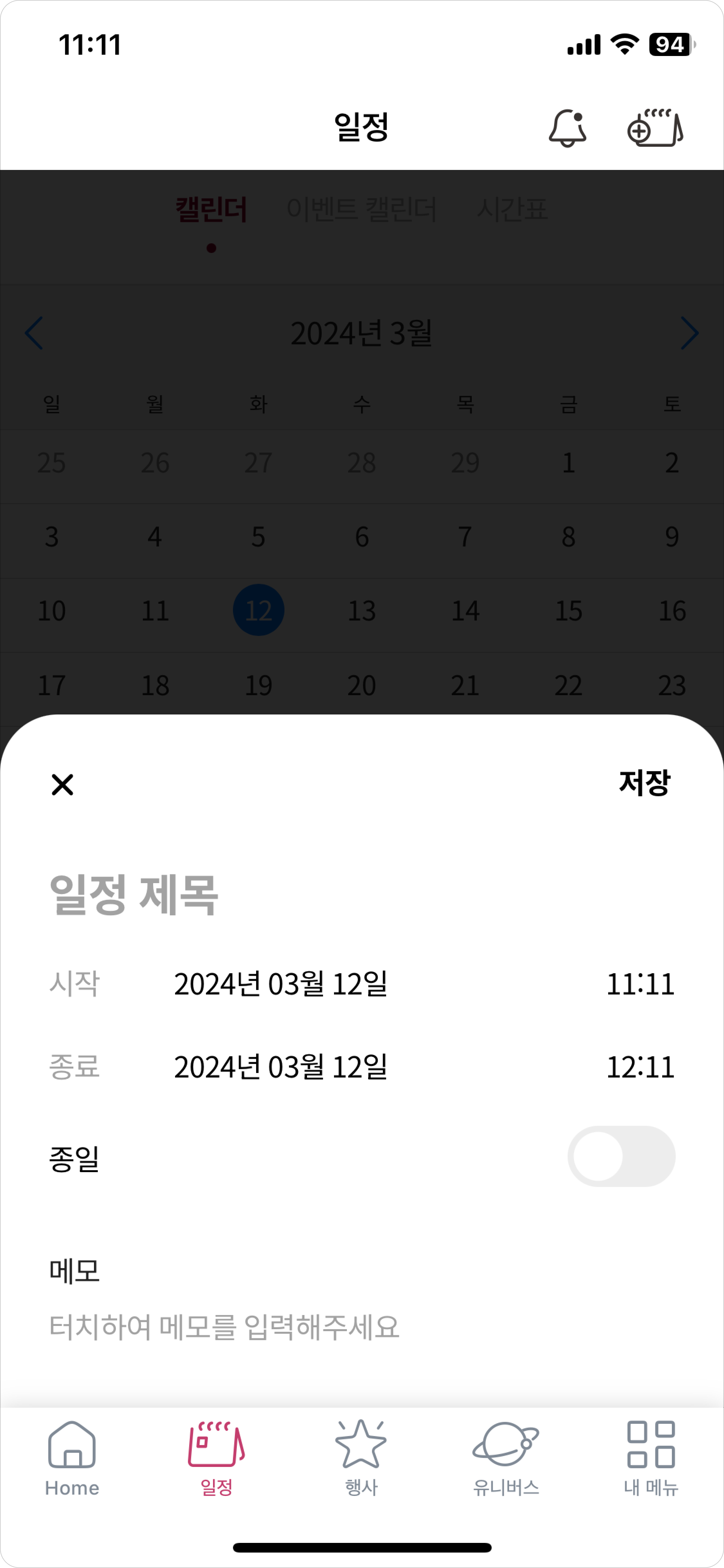
Add Event
A card slides up for content entry when adding an event
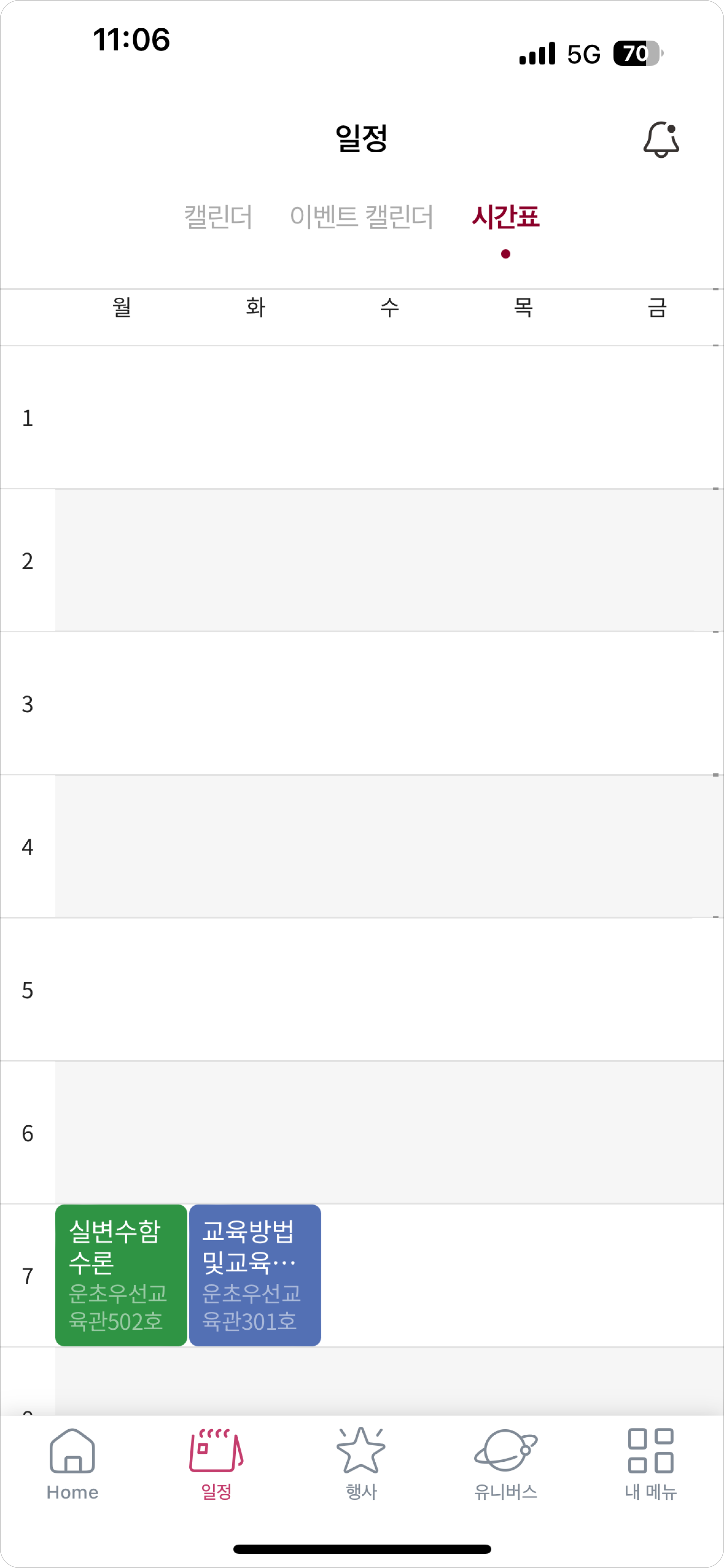
Course Timetable
View personal semester timetable
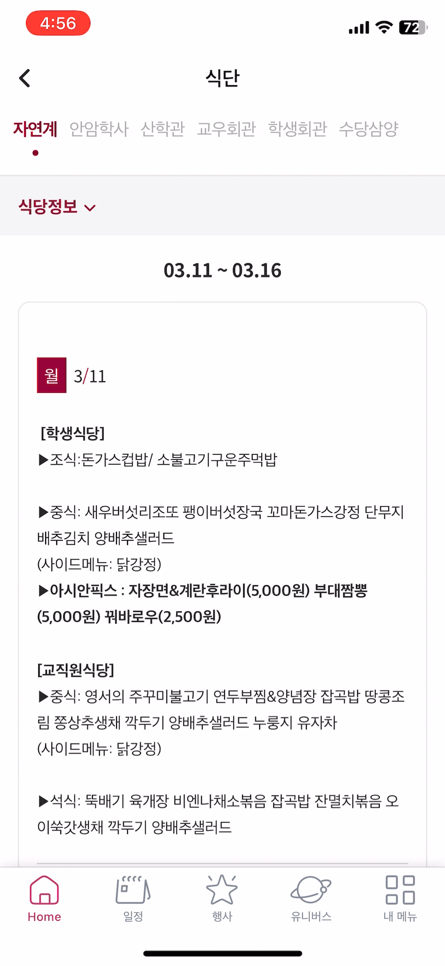
Student Cafeteria
Menus for each student cafeteria are organized in tabs. Users can expand or collapse details with a click for easy browsing.
Employee Search
Users can quickly find employees by tapping the search button on the main screen.
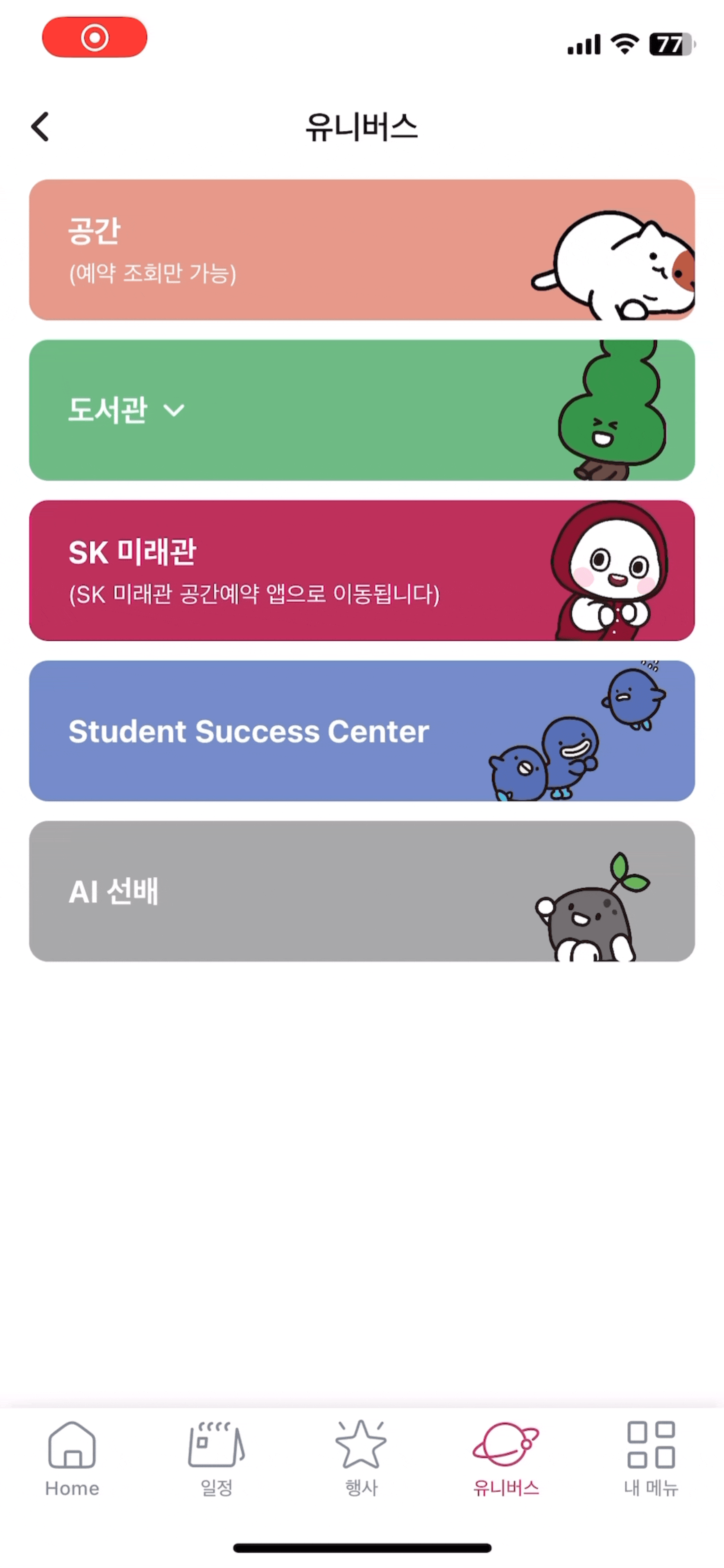
Universe Menu
This page links all Korea University reservation services via Single Sign-On, allowing seamless access without additional logins when using Hoit.
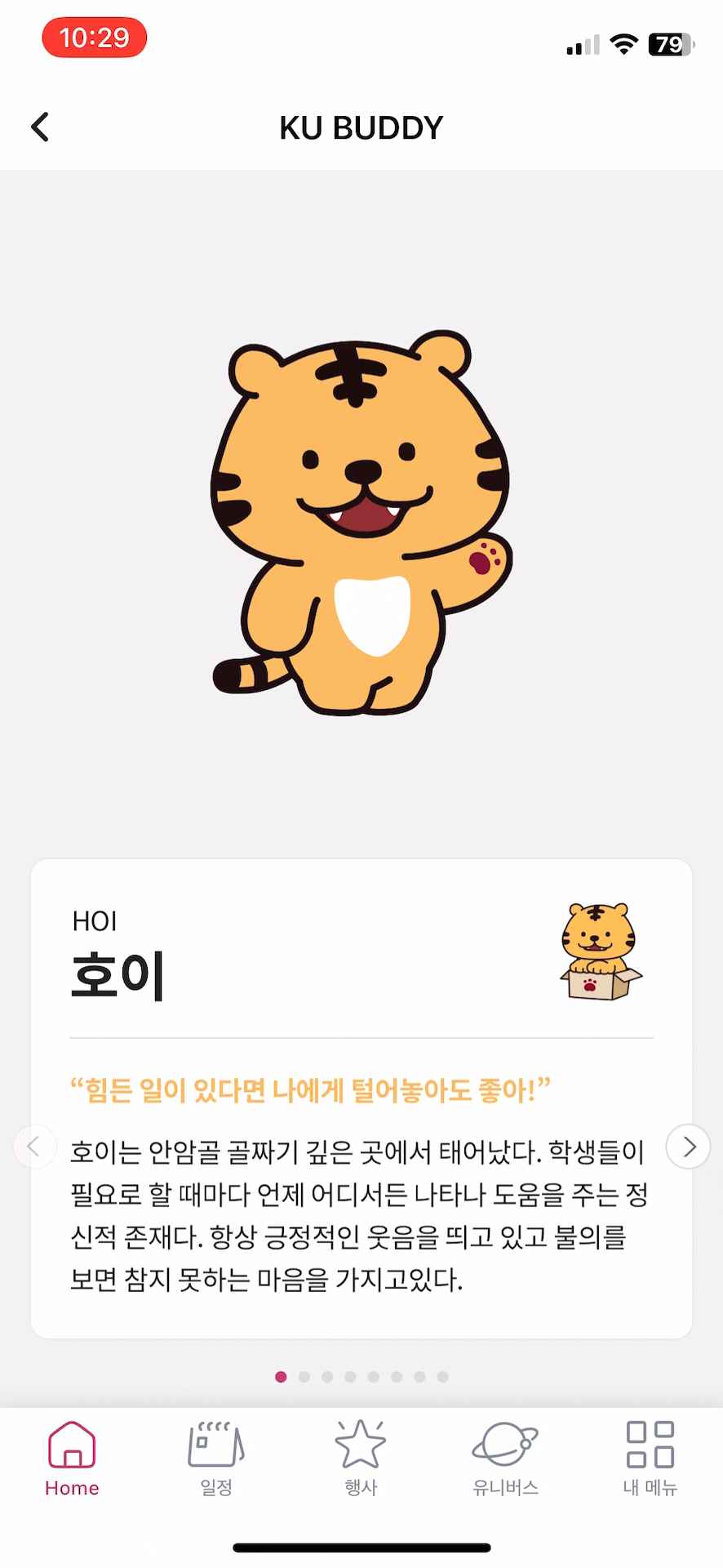
School Mascots
A page featuring school mascots with a horizontal slider to browse each character.
What changed after launch
Impact + User Feedback:
• 66% of the ~50,000 university members adopted the service after launch.
• 1,163 users responded to a survey across students, faculty, and staff.
• Most used features: announcements, cafeteria info, library Booking, and shuttle bus service.
• 1 in 3 rated the service positively, under 10% rated it negatively.
• International users showed lower awareness and satisfaction.
What I learned & what’s next
Key Learnings:
1️⃣ The need for localized onboarding, especially for international users.
2️⃣ The value of in-app guidance to surface key features.
3️⃣ The importance of cross-departmental collaboration for better awareness.
If revisited, I would improve:
1️⃣ Multilingual onboarding flows.
2️⃣ Lightweight, embedded tutorials.
3️⃣ University-wide communication strategies.