Pediatrics
A public e-learning platform designed to help teachers understand child motor development and guide students in building healthy movement habits.
Try PediatricsVancouver Coastal Health
UI / UX / Graphic Design,
Illustration, Research
Adobe Illustrator / XD, Figma
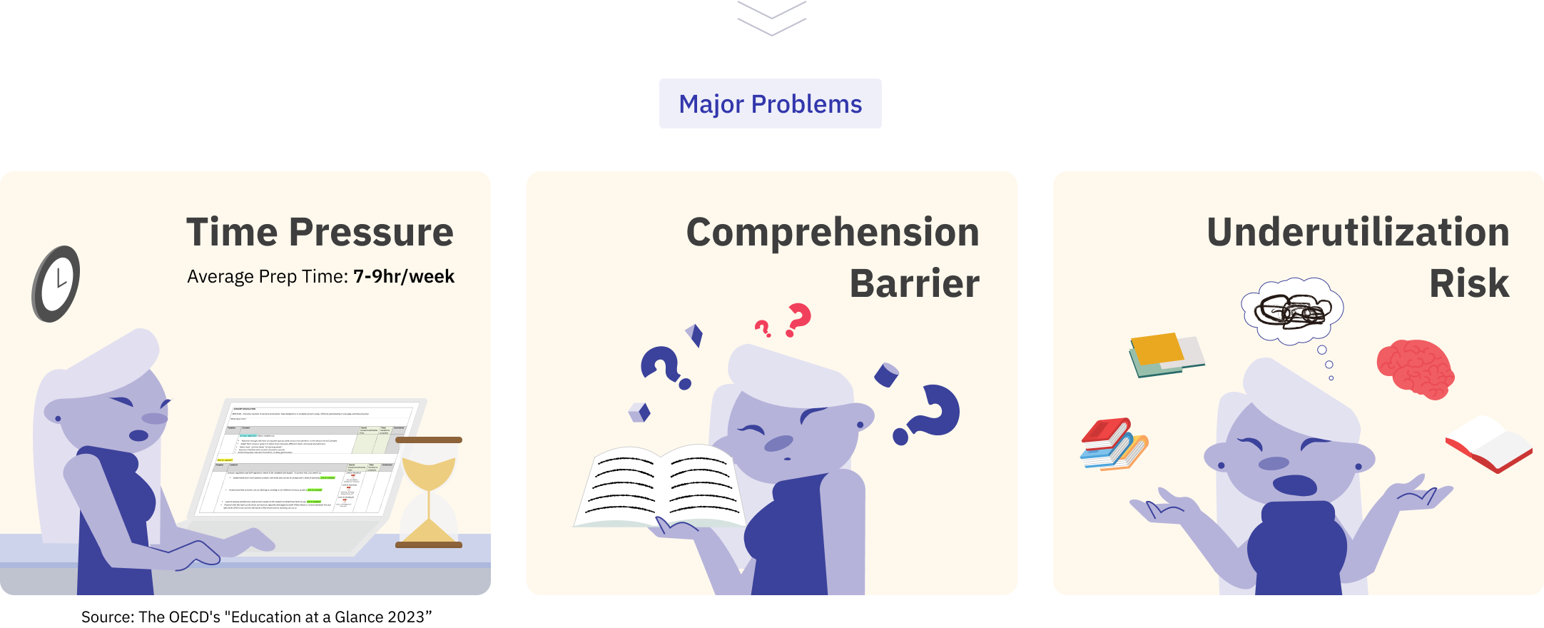
Learning materials are text-heavy
Government-issued teacher resources are mostly dense, text-heavy documents. They are often filled with academic jargon and require significant time to digest.
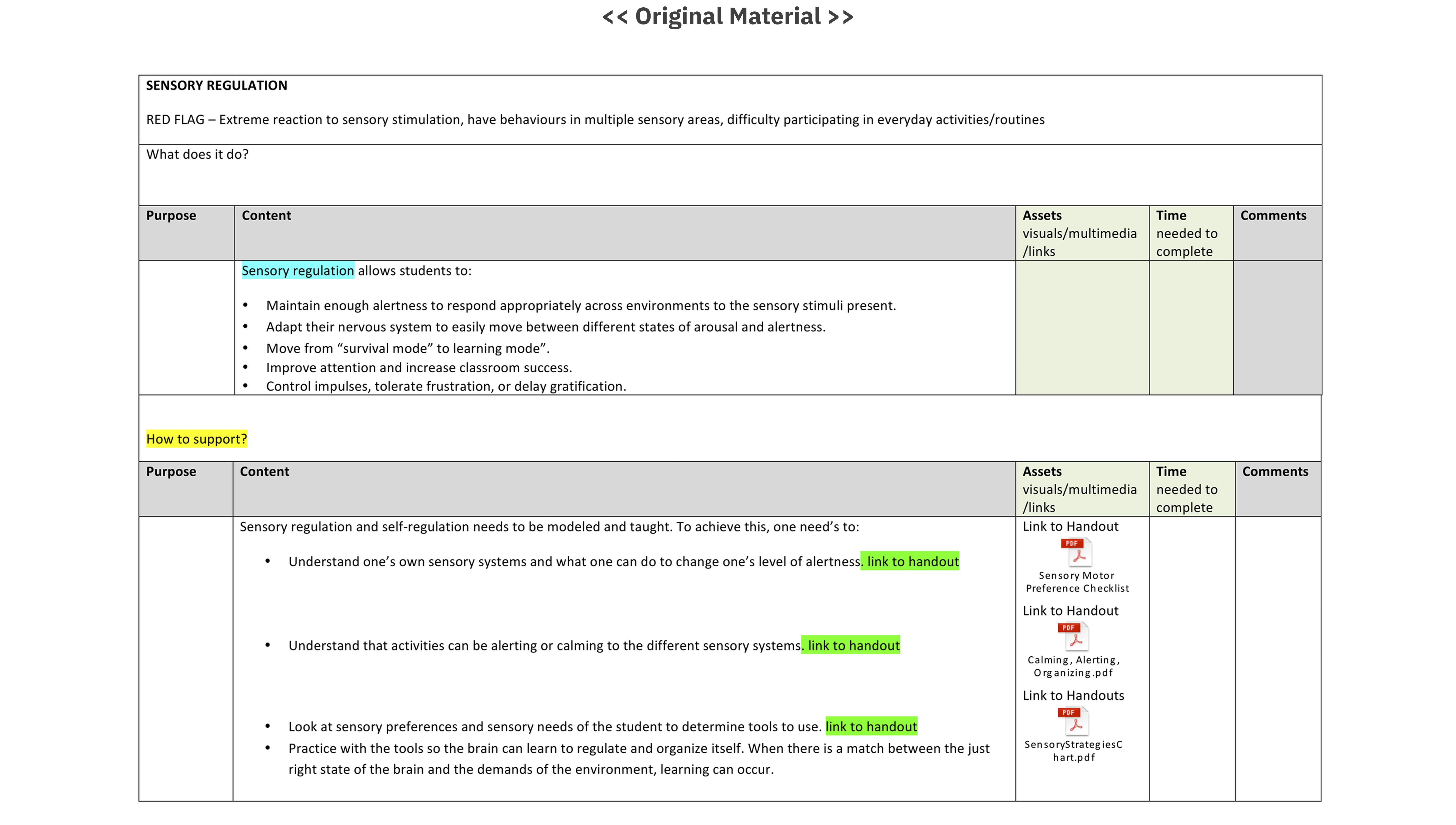
Teachers, who already face limited preparation time, find it challenging to extract what is most relevant for classroom practice.
As a result, these materials risk being underutilized and failing to support engaging, practical lessons.
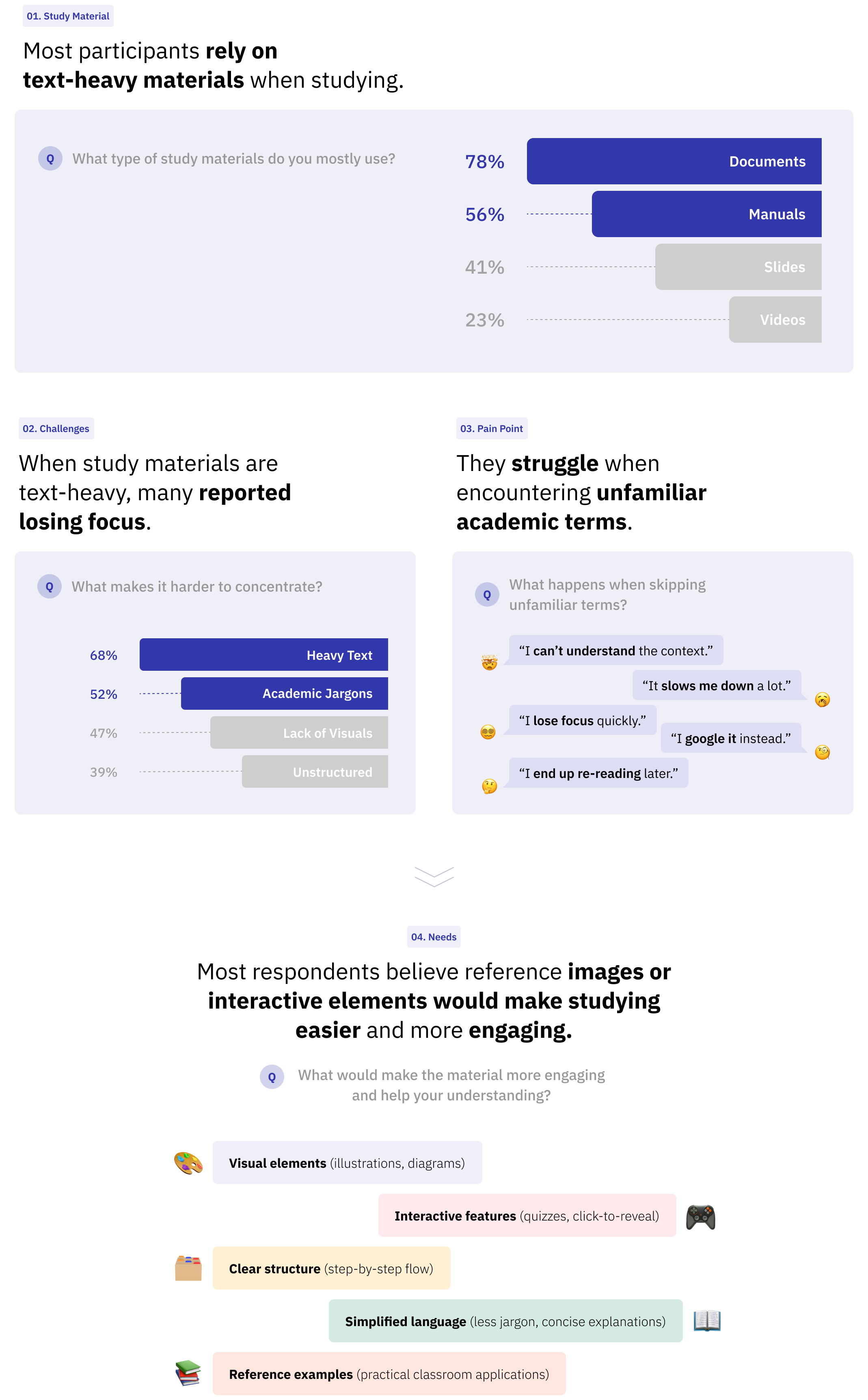
To validate this problem, a survey was conducted with 30 adult learners
(potential users)
The results confirmed that many found it hard to stay focused with text-dominant resources and struggled with unfamiliar jargon.
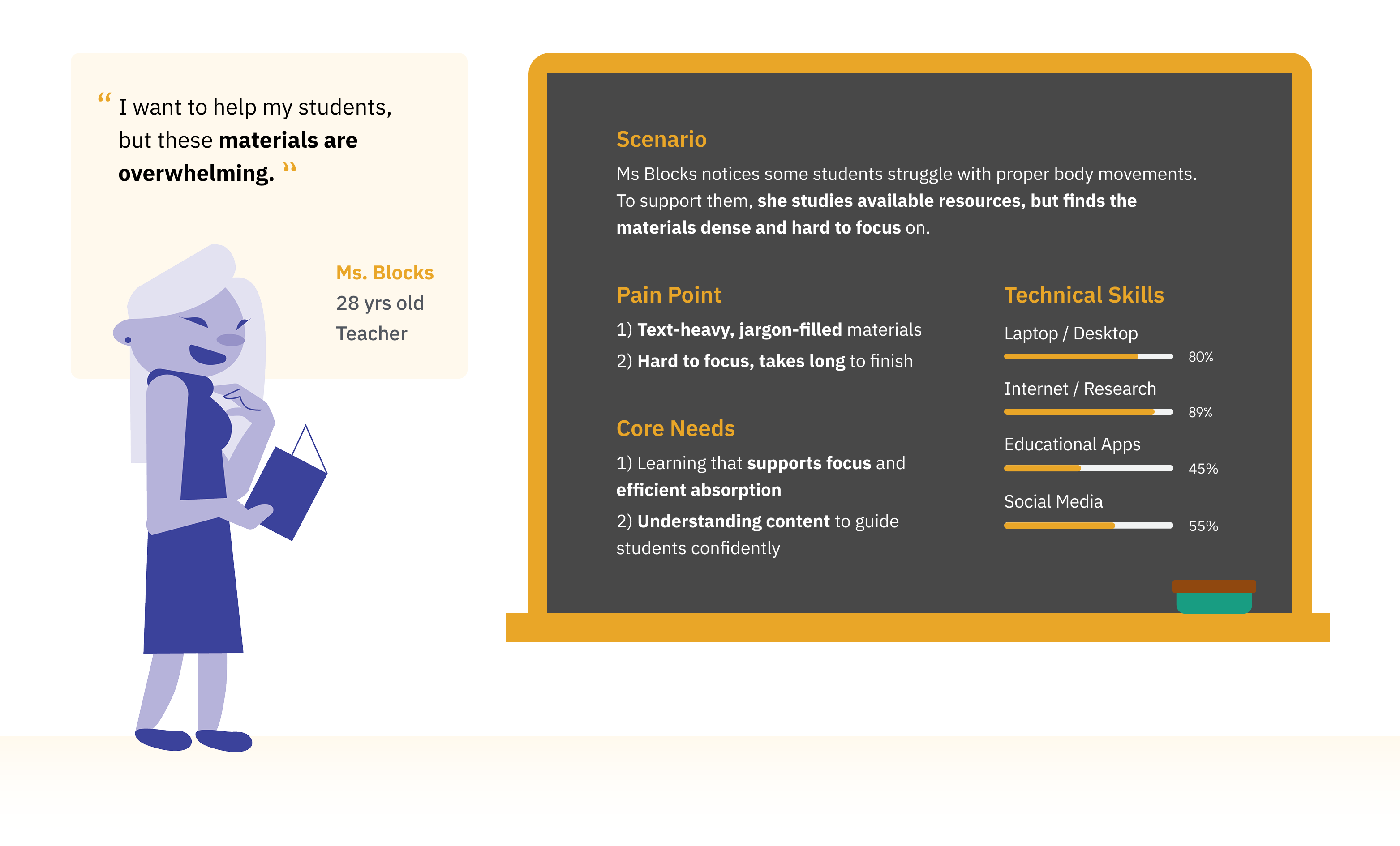
From these findings, a persona was developed to understand user pain points
Ms. Blocks, a motivated educator with limited time, low tolerance for jargon, and a clear need for simple, visual, and practical learning tools.
This persona guided design decisions by keeping the focus on usability.
How might we make dense materials engaging and easy for teachers to use?
“Engaging and Fun Learning”
Insights from the persona showed that the platform needed to shift from a
passive, text-heavy reading experience ➡️ active, visual, and structured learning flow
What’s the challenge and goals?
With 3 modules in total, module 1 and the style guide already designed by a senior, I had to extend the style for modules 2–3 under constraints. My goals were to:
1️⃣ Preserve visual and structural consistency by following the existing style guide and fixed UI placements.
2️⃣ Design engaging visuals and interactions to maintain user attention throughout educational content.
3️⃣ Incorporate three mascot characters effectively within the interactive modules.
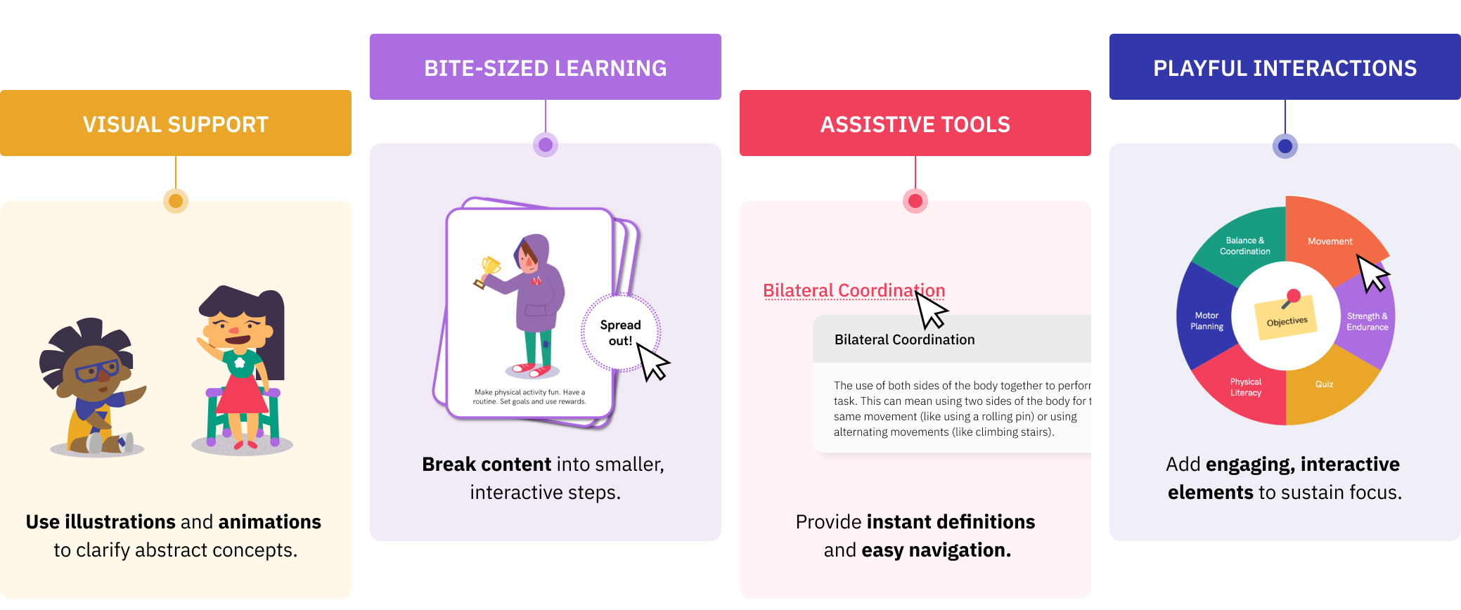
From Problems to Solutions
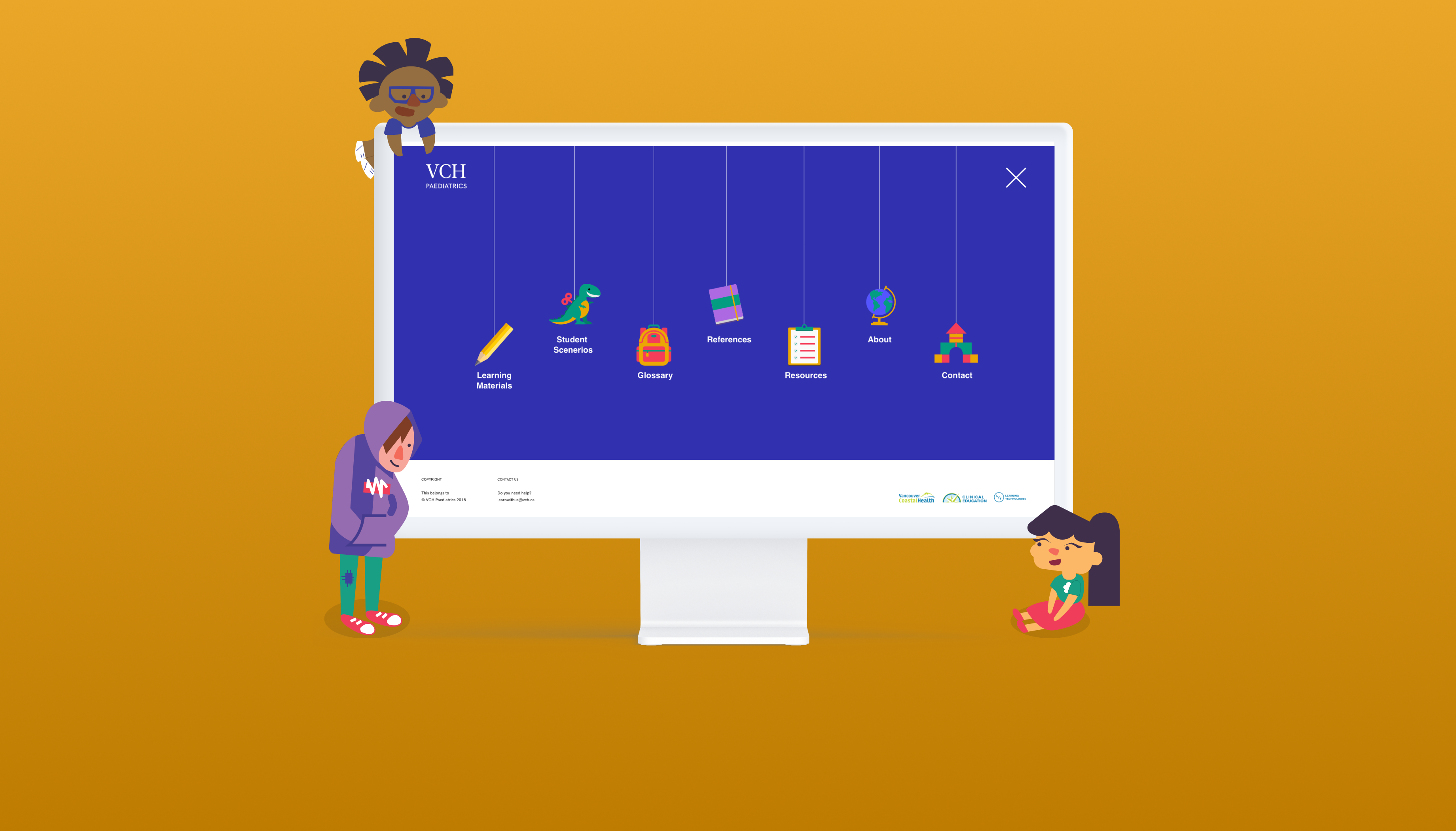
✅ Solution: A series of interactive intro screens create a positive first impression while guiding users toward their learning goals.
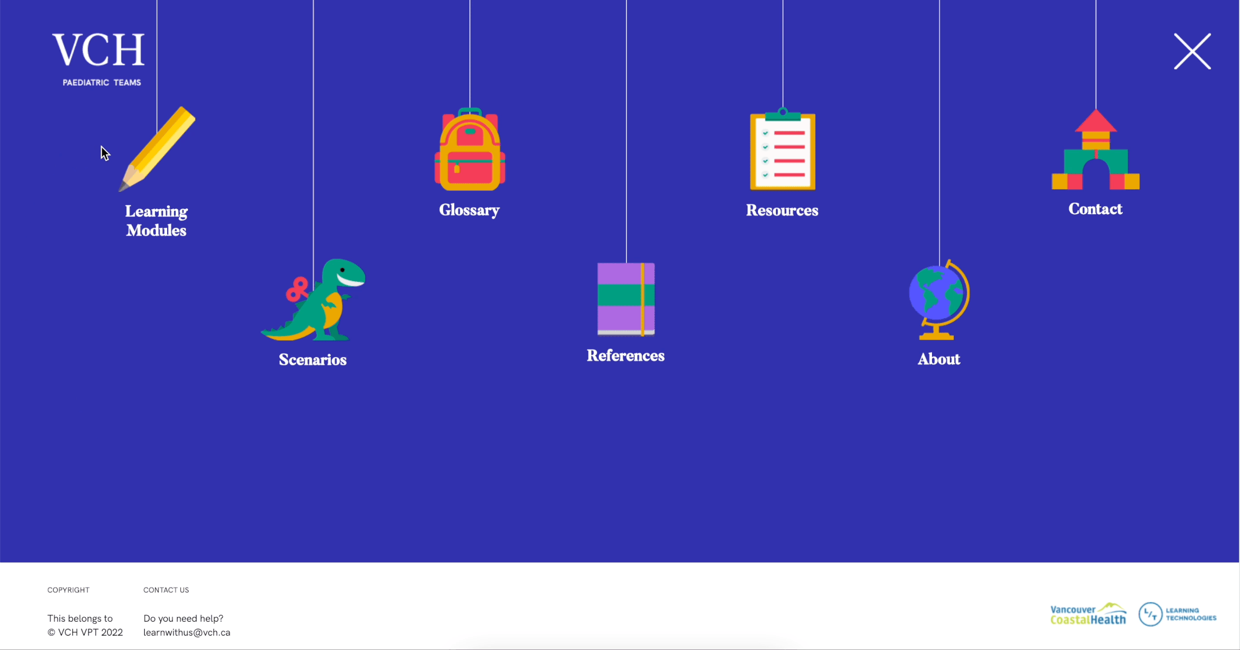
Menu items bounce on hover, providing tactile feedback and allowing teachers to quickly see all available options and choose where to go.
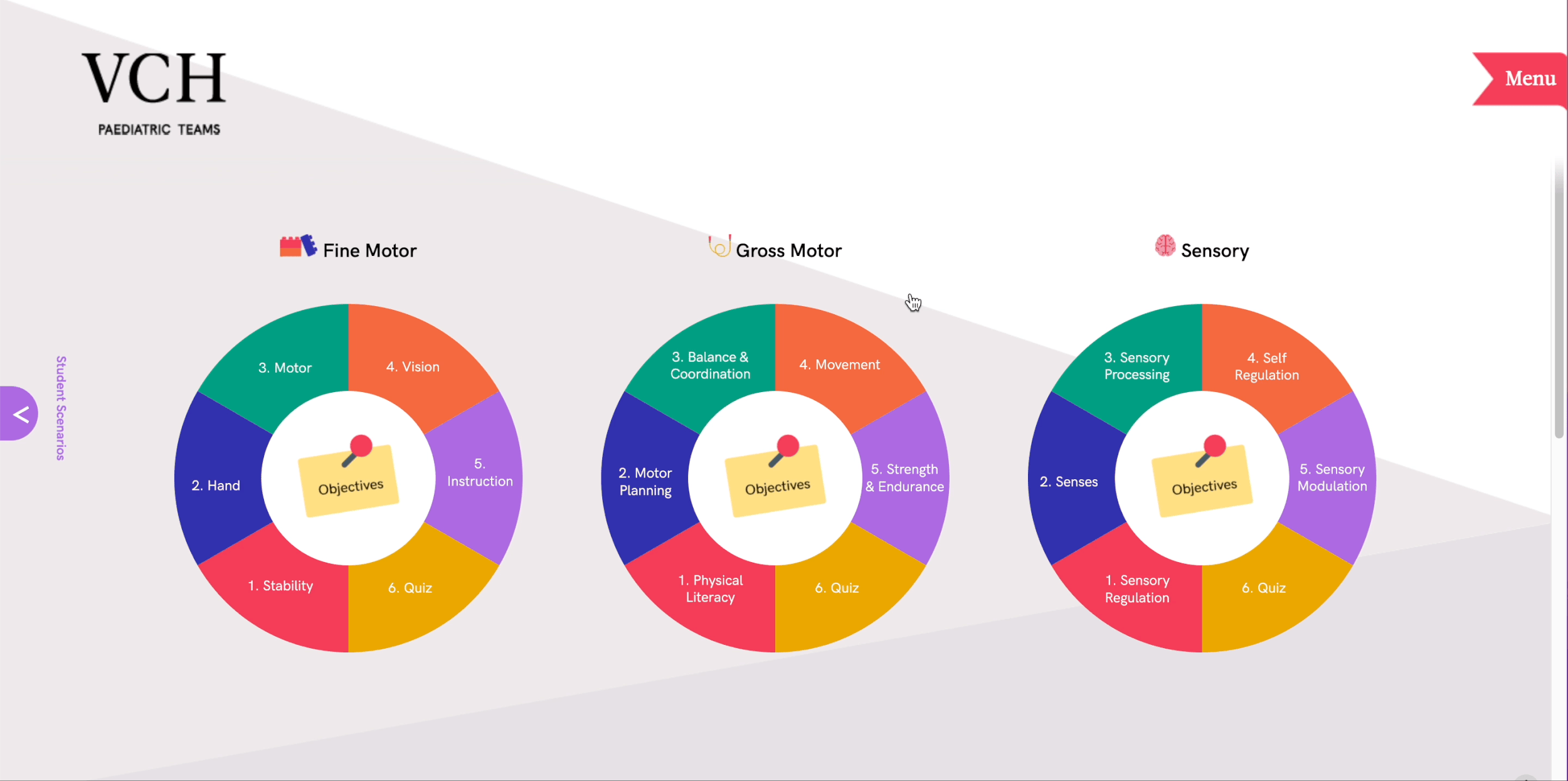
Module overview clearly displays objectives at the center, interactive blocks enlarge on hover.
✅ Solution:
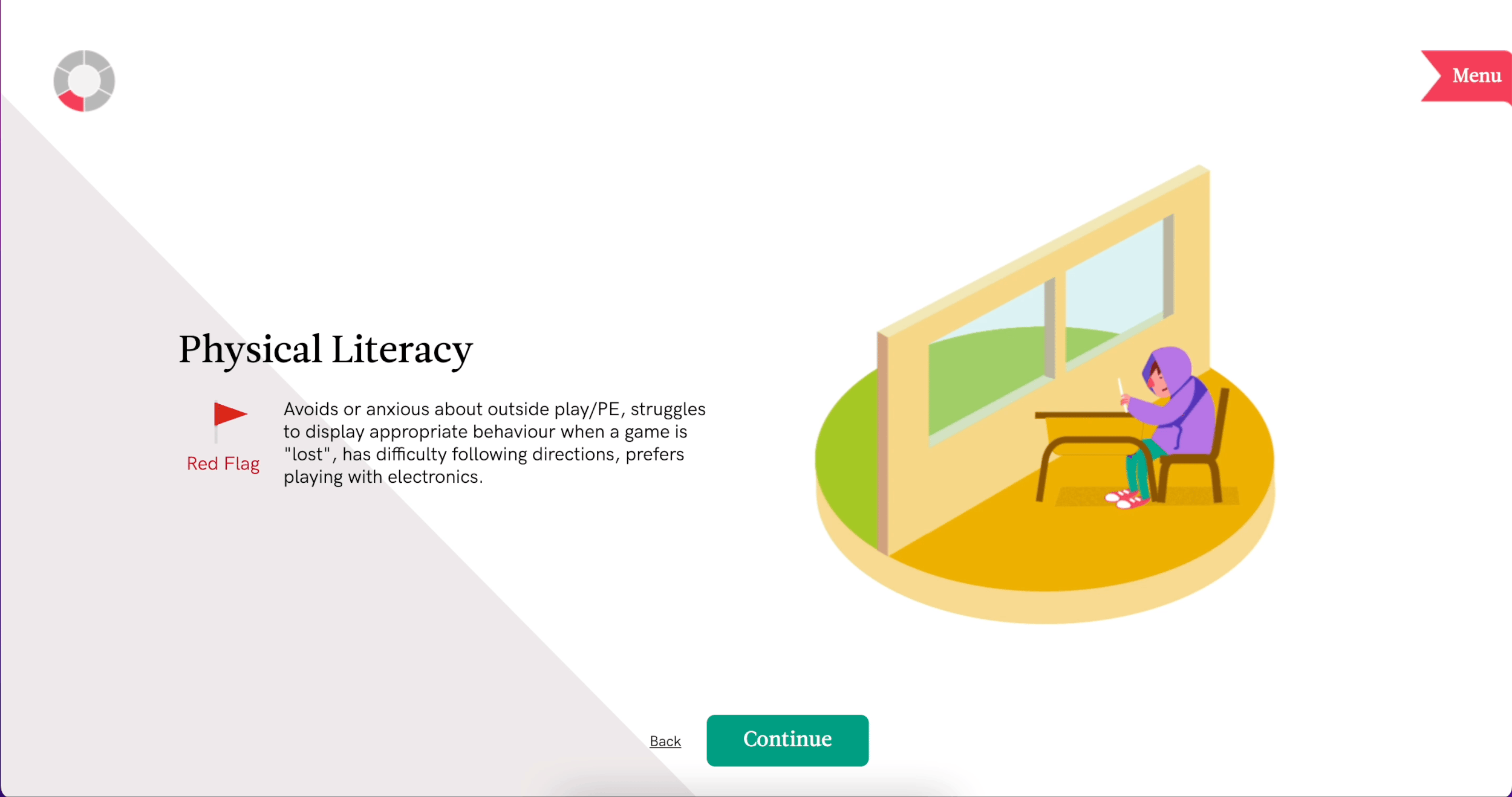
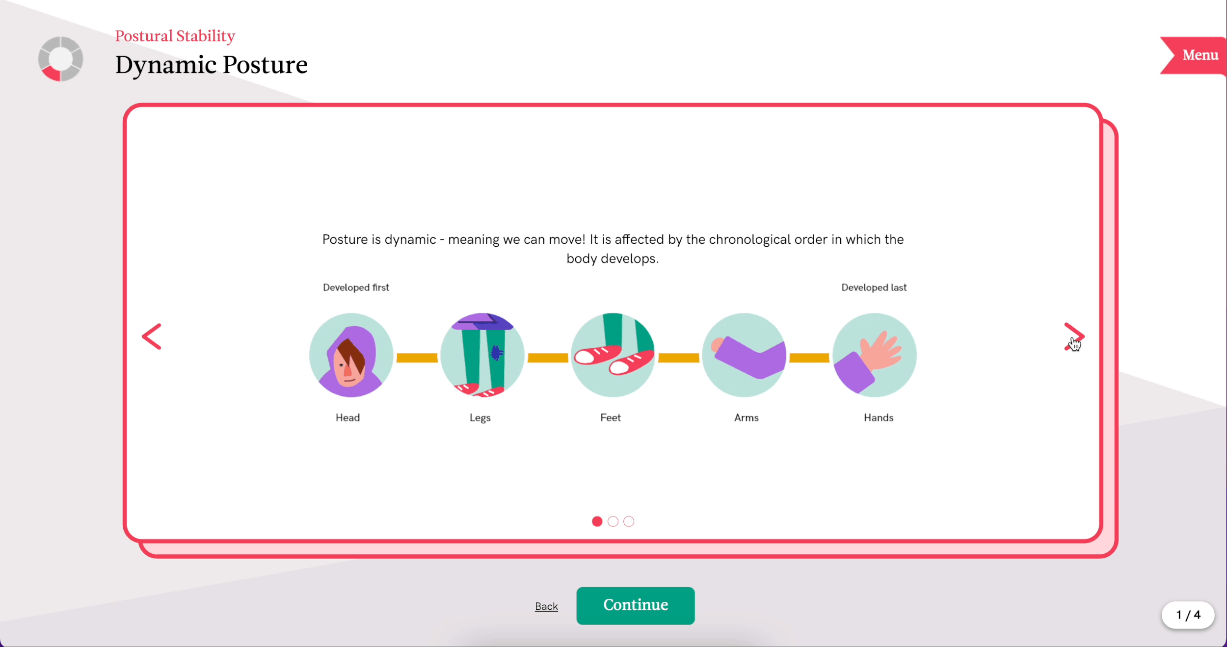
➀ Custom illustrations are incorporated throughout each module to visually reinforce key concepts and improve readability.
➁ Looping animations at chapter starts draw attention and spark curiosity.
Animated screen introduces the chapter and highlights key concepts.
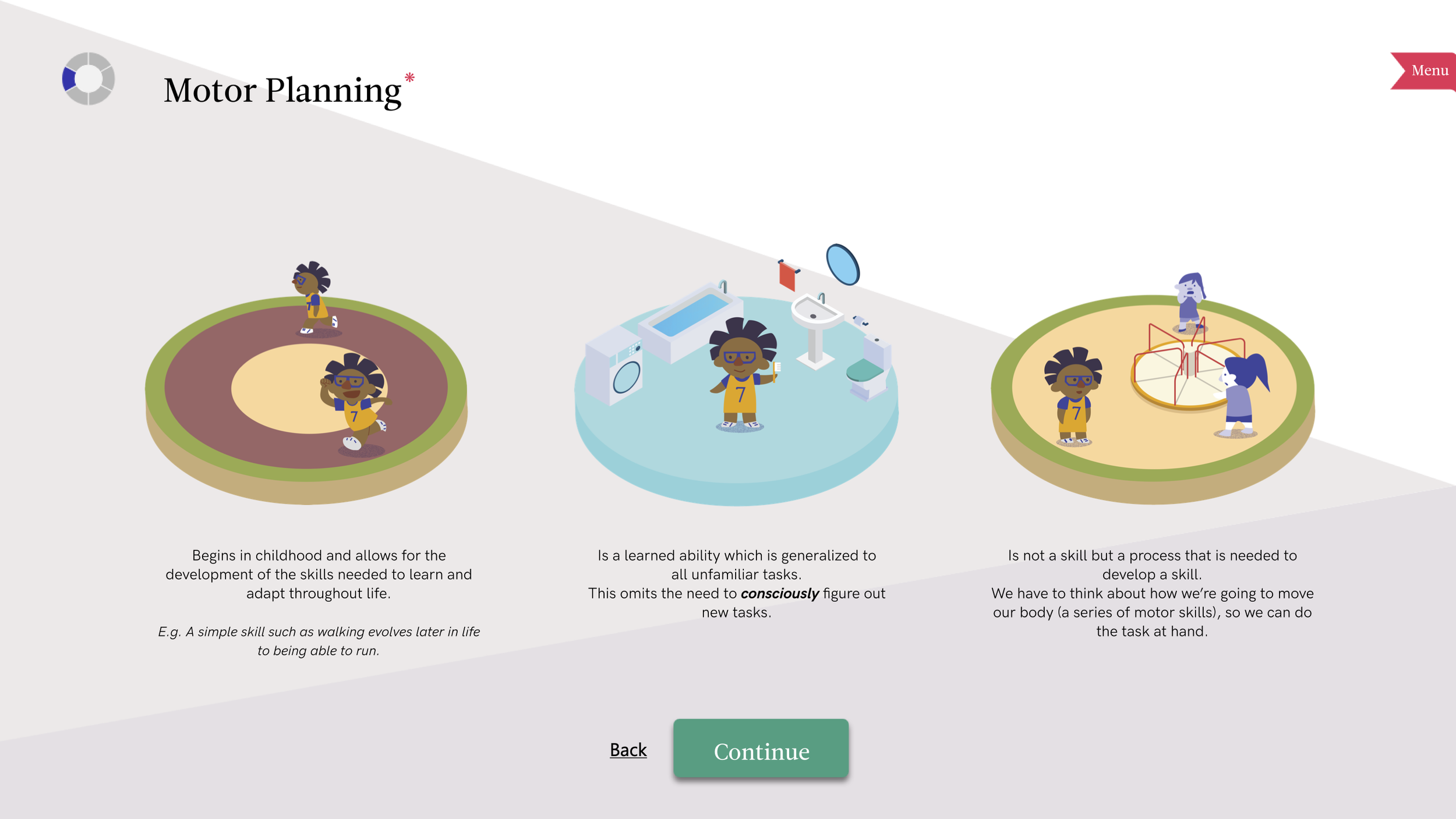
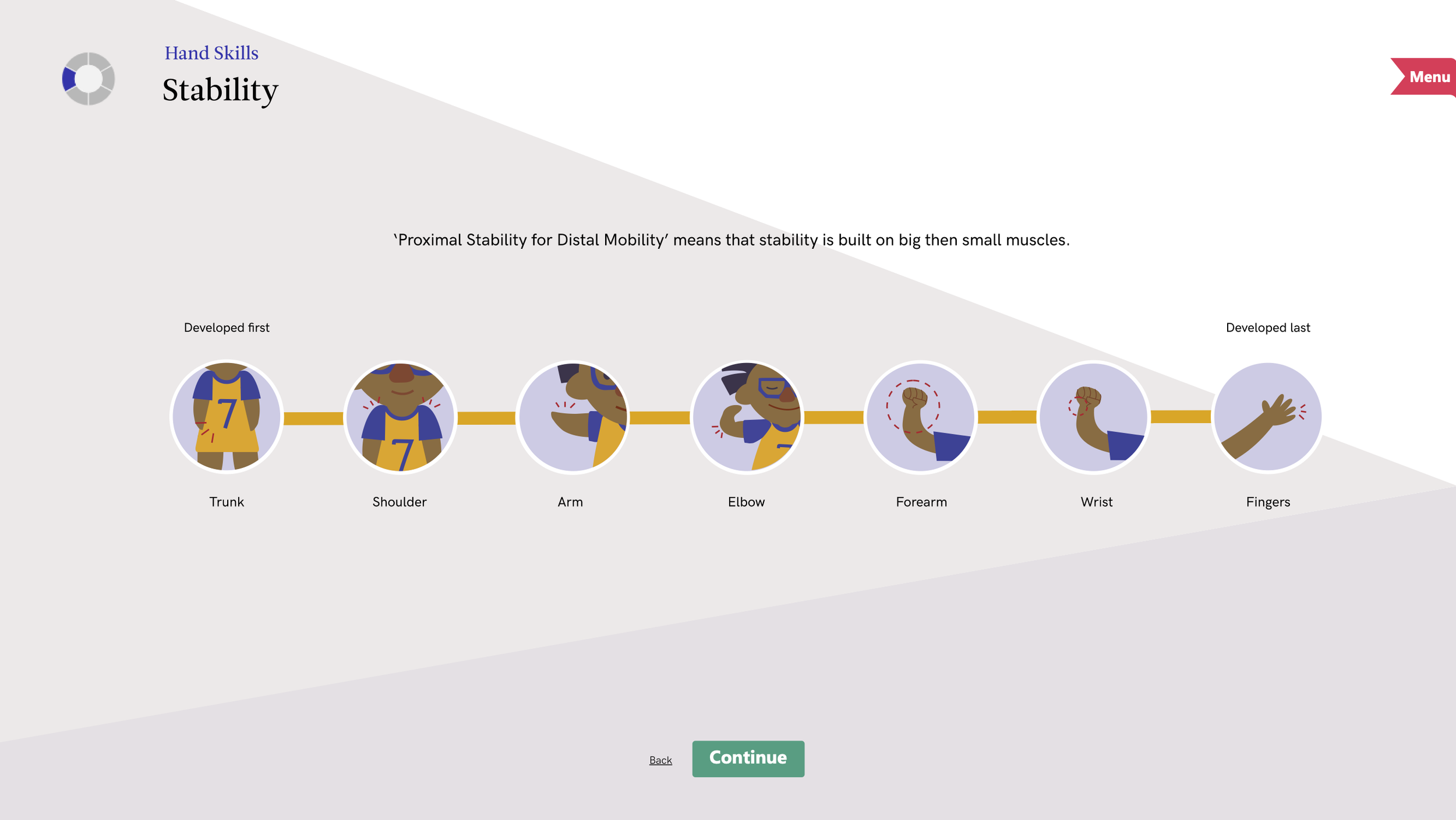
Illustrations are used as reference images to visually reinforce the written content, bridging the gap between information and understanding.
✅ Solution: Assistive features help users find information efficiently and reduce cognitive load.
These features support focus through seamless navigation and quick comprehension.
🔍 Instant Definitions: Hover over red-underlined terms for concise pop-up definitions.
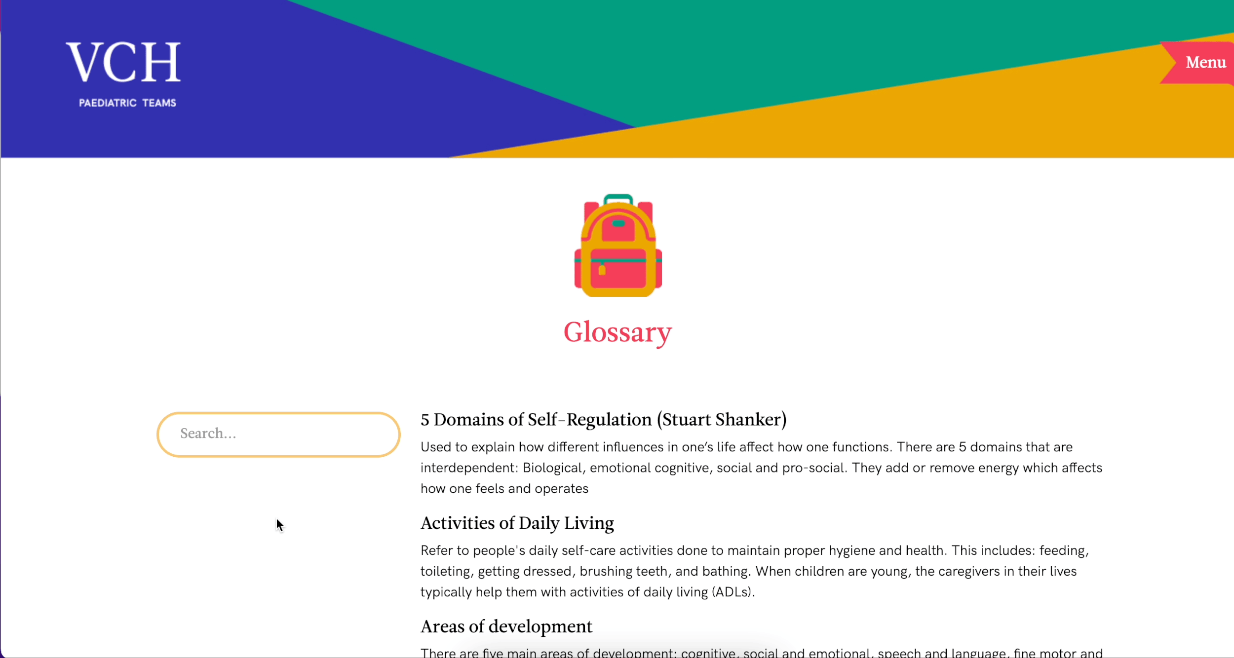
📘 Glossary & Sticky Search Bar:
Dedicated glossary for easy review. Search bar remains accessible while scrolling.
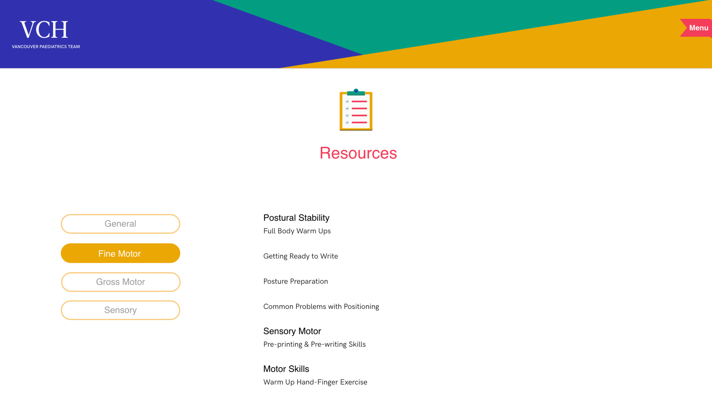
📂 Organized Resources:
Module-based categorization allows quick access to relevant materials.
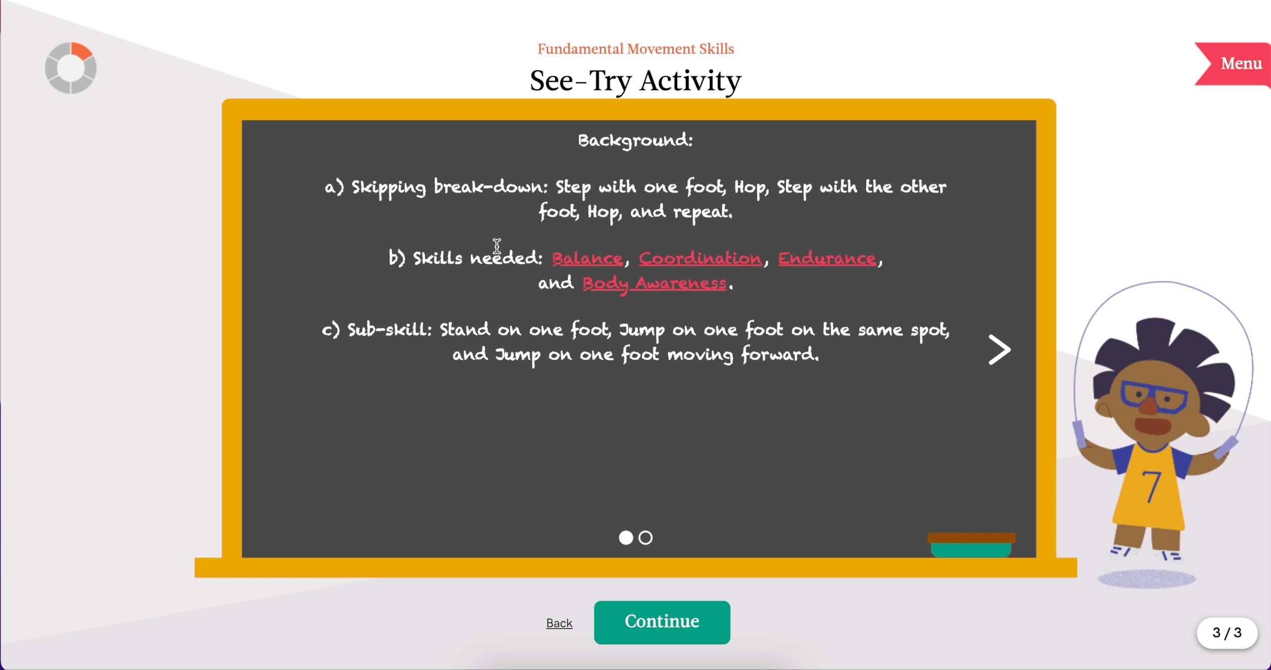
✅ Solution: Interactive features breaks content into manageable steps and keeps learners engaged.
It makes the experience intuitive and memorable, allowing users to explore material at their own pace.
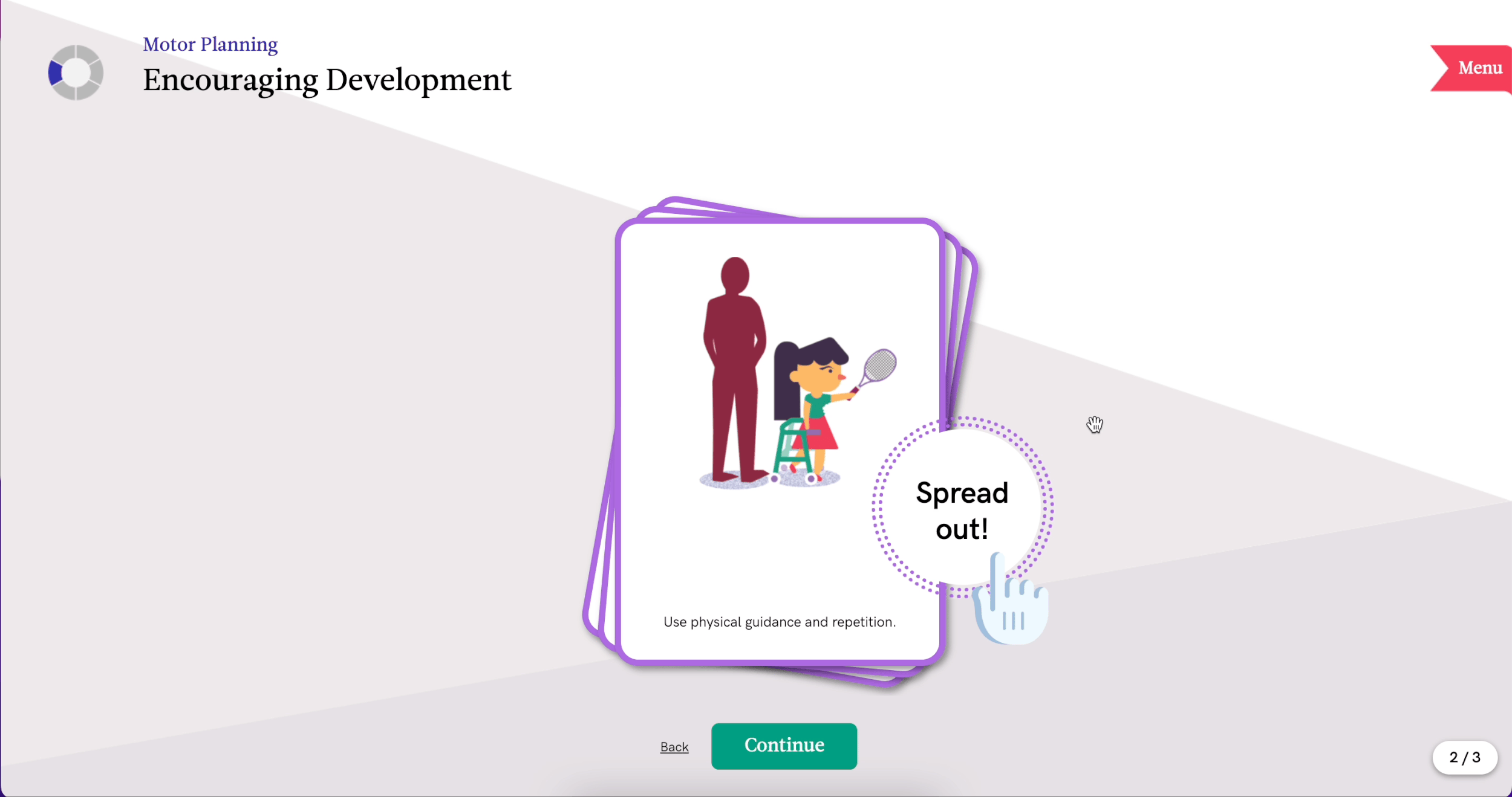
🃏 Click to Reveal: Cards expand to show more content.
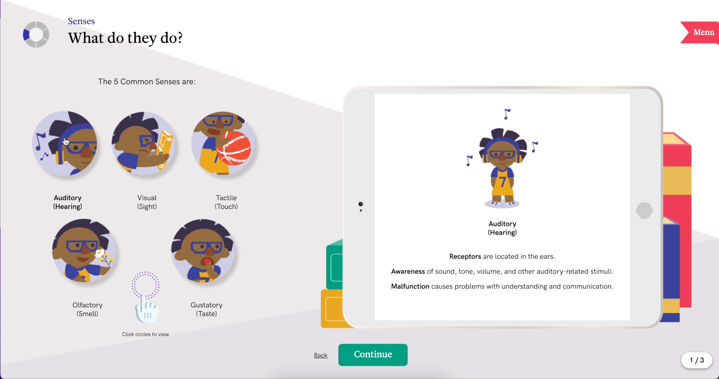
🖥️ Button Triggers: Tap buttons to display info on a virtual tablet.
🖼️ Carousel Navigation: Users swipe or click through sequences at their own pace.
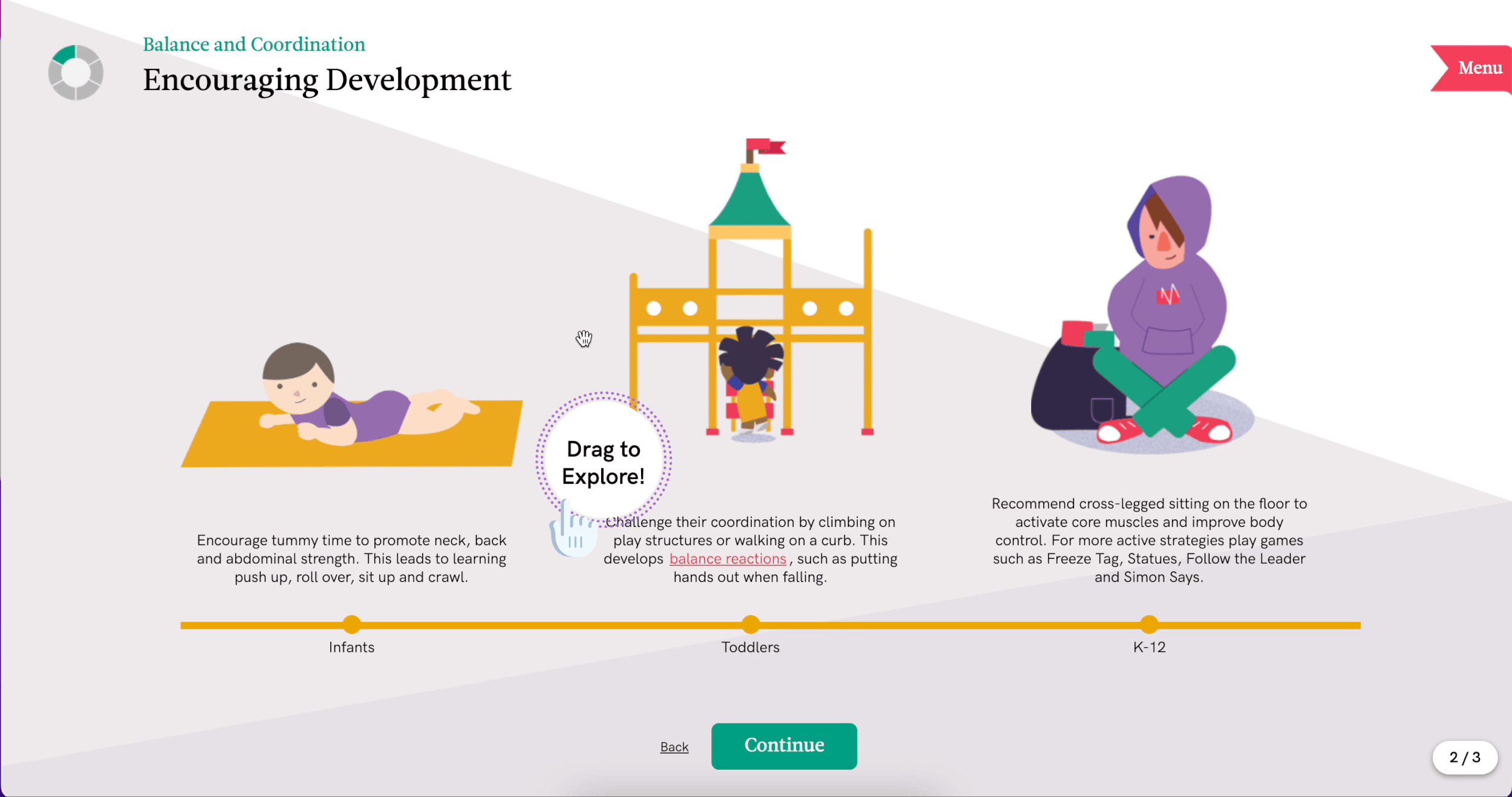
🧲 Click & Drag: Horizontal exploration allows continuous browsing without clutter.
Visual Style
The design follows Vancouver Coastal Health’s style guide, using bright, energetic colors to create a positive learning environment.
Three mascot characters were embedded to help teachers connect content with real classroom contexts.

What have I learned?
Key Learnings:
1️⃣ Verify technical feasibility early by collaborating closely with developers.
2️⃣ Iterative client feedback is essential for refining visual communication.
3️⃣ UI specification and asset documentation are critical for post-launch success.
If revisited, I would:
1️⃣ Explore more diverse interaction patterns for engagement.
2️⃣ Further streamline workflow and cross-team communication to deliver faster and more consistent results.